course_dv
Introduction to Exploratory Data Analysis (EDA)
EDA is a critical skill for data professionals. It involves examining datasets to summarize their main characteristics, generally using visual methods. This process helps in understanding the data, identifying patterns, and explaining relationships.
Outcomes:
- Distinguish between EDA and CDA
- List steps in the EDA process
- Explain why we use a visual approach
Links:
What is EDA?
Exploratory Data Analysis will be our primary tool for understanding data. It is an approach that emphasizes:
- Understanding your data (fields and structure)
- Creating visualizations
- Communicating insights through reports and presentations
This is different from Confirmatory Data Analysis. You are probably familiar with CDA, which is more commonly used in your statistics classes. CDA is often focused on making predictions about a larger population based on a smaller sample. It uses statistical tests to confirm or reject hypotheses. CDA is more focused on numbers and statistical measures (mean, variance, correlation, etc…) than on visualizations.
This is also different from Machine Learning or Artificial Intelligence. ML/AI approaches build models to predict future outcomes. They are more pragmatic and less focused on understanding the data, and typically work much larger and messier datasets than traditional statistics.
This course is more focused on business data. CDA generally assumes that we do not have complete data and are sampling a larger population. With EDA, we often have 100% of the available data (for example, sales). We are not going to handle some of the messy big data that ML/AI approaches use (for example, all Tweets about Trump). Instead, we will focus on understanding and communicating insights from business data.
EDA Process
The EDA process generally follows these steps. A good data analyst will iterate through these steps multiple times.
- Examine your data
- Values
- Look for missing values, outliers, codings, etc…
- Identify type:
- String or number (integer v. decimal)
- Continuous v. discrete
- Structure
- Long v. wide data, roll-up, cross-sectional, etc…
- Values
- Visualize each variable
- Map data using pre-attentive attributes
- Avoid perceptional problems
- Identify distributions:
- Normal curve, uniform, exponential, bimodal
- Look for correlations between variables
- Visualize relationship between variables
- Find cause and effect
- Find moderating or mediator variables
- Tell a story
- Develop a argument
- Convert exploratory visualizations into explanatory visualizations
- Create a report, presentation, or infographic
Why a visual approach?
Your classes understand data with different techniques. This class focuses on EDA, which is primarily visual.
Follow-up classes, such as Data Modeling in Python (BUDA 451/ACCT 426), use a statistical or machine learning approach. However, these classes build on the foundation of EDA. If you don’t understand your data, you cannot build good models.
Charts can reveal patterns not seen through normal statistical measures. One classic validation of this is Anscombe’s Quartet. These data points have the same statistical properties (mean, variance, correlation, regression line), but look very different when graphed.
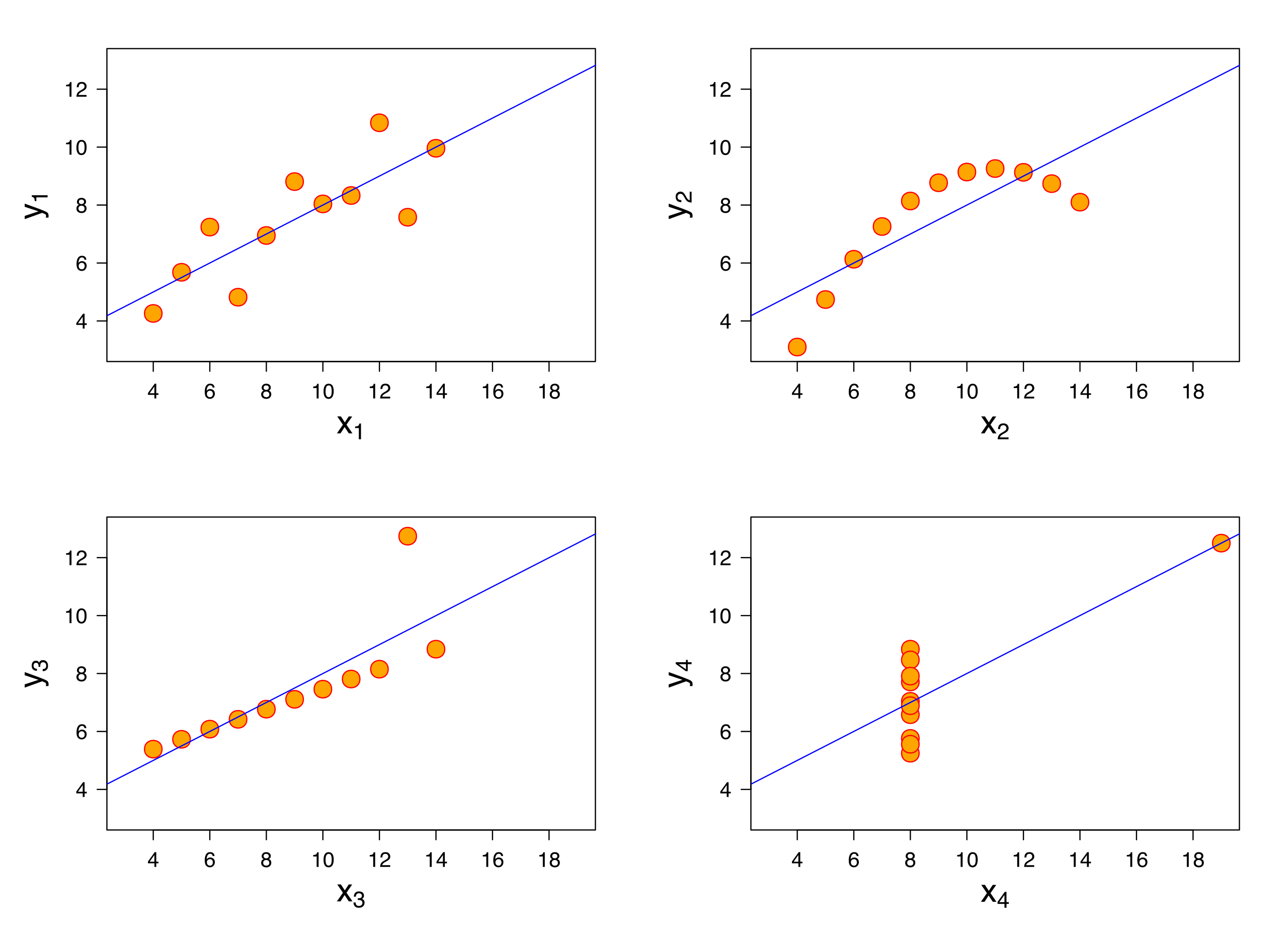 Source: Wikimedia Commons, By Anscombe.svg: Schutz: Avenue - Anscombe.svg, CC BY-SA 3.0, https://commons.wikimedia.org/w/index.php?curid=9838454
My favorite validation is the Datasaurus Dozen.
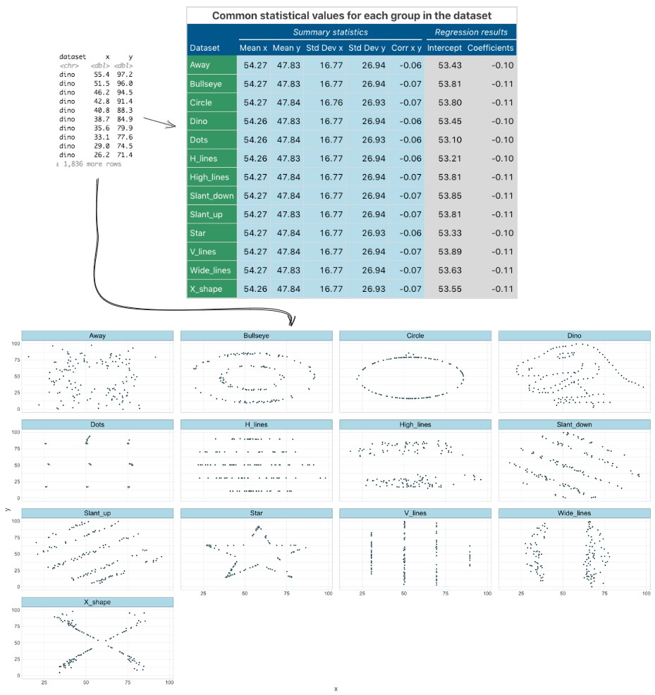 Source: Wikimedia Commons, By IngmundForberg - Own work, CC BY-SA 4.0, https://commons.wikimedia.org/w/index.php?curid=138051422
These datasets all have the same statistical properties, but look very different when graphed. This shows the power of visualizing data to understand its true nature.
What is a visualization?
Tables are not charts! A table is a structured arrangement of data in rows and columns. While tables are useful for organizing information, they do not provide the visual cues necessary for quick comprehension and pattern recognition.
Charts, on the other hand, are graphical representations of data that use visual elements like bars, lines, and points to illustrate relationships and trends. Charts leverage our brain’s ability to process visual information rapidly, making it easier to identify patterns, outliers, and correlations within the data.
Not all visualizations are charts. For example, the Venn Diagram below is a visualization that shows relationships between sets, but it is not a chart. A chart must map data to visual attributes (position, size, color, shape, etc…). The Venn Diagram does not do this; it simply shows overlapping areas to represent relationships.
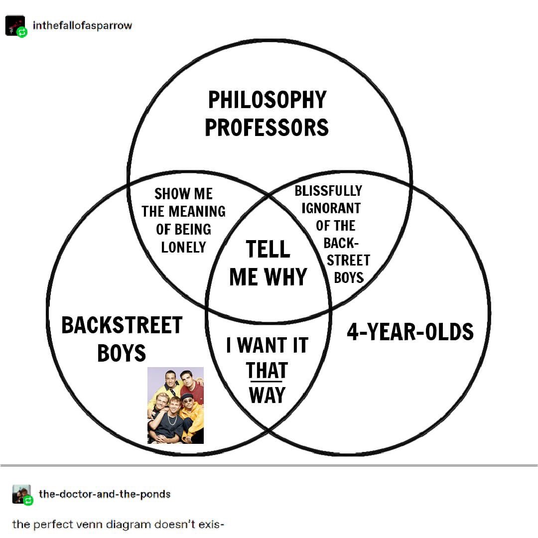
Chart designs must align with people’s visual perception systems. Poorly designed charts can mislead viewers. Creating effective charts requires understanding how to map data to visual attributes and how people perceive these visuals.
Good examples
- 2 minute video on 12,100 years of population change, visualized
- Infographic on Households with no income
- Report on where vacation homes are located in the US?