course_dv
Tableau Basic Charts
This module introduces basic chart types in Tableau. We will cover how to create and customize common visualizations such as bar charts, line charts, scatter plots, histograms, box plots, heat maps, and maps.
Outcomes:
- Create heat maps, bar charts, histograms, scatterplots, boxplots, line charts, and combo charts
- Describe what each chart is best used for
- Match a chart to the data structure and analysis goal
- Match a chart type to the appropriate pre-attentive attributes
Links:
Terminology
Most charts have an x-axis and a y-axis. In Tableau, these are called Columns and Rows, respectively. The x-axis (Columns) is horizontal (from left to right). The y-axis (Rows) is vertical (up and down).
Best practices suggest that the x-axis (Columns) should contain the independent variable (cause), and the y-axis (Rows) should contain the dependent variable (effect).
Heat Map
- Best for
- 2 dimensions
- 1 measure
- Pre-attentive attributes
- Color (use sequential and diverging scales, not categorical)
- Limits
- Color has limited accuracy
- Hard to visualize too many numbers
- Basic features
- Sort by dimension name or by measure value
Process:
- Drag a dimension onto Columns and another onto Rows
- Drag a measure onto Marks -> Label and Marks -> Color
- Change the mark type to square
- Change the color scale to either sequential or diverging
Bar
- Best for
- 0-1 dimension
- 1 measure
- Pre-attentive attributes
- Length (either stacked or at zero)
- Color (either categorical, sequential, or diverging)
- Limits
- Best for n<10
- Hard to visualize very precise data (use histogram instead)
- Basic features
- Sort by dimension name or by measure value
Process:
- Drag a dimension onto Columns (for vertical) or Rows (for horizontal)
- Drag a measure onto the other shelf (Rows for vertical, Columns for horizontal)
- (If needed) Change the mark type to bar
- (If needed) Drag a measure to Marks -> Color
- Change the color scale to either categorical, sequential or diverging
Histogram
- Best for
- No dimensions
- 1 measure
- Pre-attentive attributes
- Length (either stacked or at zero)
- Color (not as useful, but you can pick either sequential or diverging)
- Limits
- Best for n>10
- Best for very precise data
- Basic features
- Set a custom bin size
- Advanced features
- Remove outliers
Process:
- Right-click on a measure and select
Create->Bins... - Drag the new bins dimension onto Columns or Rows
- Drag the old measure onto the other shelf (Rows for vertical, Columns for horizontal)
- Make sure that it shows
COUNTof the measure, not SUM or something else.
- Make sure that it shows
- (If needed) Change the mark type to bar
- (If needed) Drag a measure to Marks -> Color
- Change the color scale to either categorical, sequential or diverging
Scatterplot
A scatterplot us a shows the relationship between two numeric dimensions. Each point represents a row in the dataset.
A common analytical technque is to split the graph into 4 areas, using the zero point of each axis. This creates quadrants that can help identify patterns.
- Best for
- 2 numeric dimensions
- 0-1 measure (aggregated or disaggregated)
- Pre-attentive attributes
- Color (best for n<=5 categorical)
- Position on a common scale (x, y)
- Size
- Limits
- Best for n>100
- Best for a cause (x) and effect (y)
- Basic features
- Show either aggregated or disaggregated data
- Advanced features
- Trend lines, reference lines
Process:
- Drag a numeric dimension onto Columns
- Drag a numeric dimension onto Rows
- Choose 1:
- Aggregate by a dimension -> drag a dimension to Marks -> Detail
- Disaggregate to show all rows -> Analysis -> Uncheck
Aggregate Measures
- (If needed) Drag a measure to Marks -> Color
- Change the color scale to either categorical, sequential or diverging
- (If needed) Drag a measure to Marks -> Size
- Change the size scale to either categorical, sequential or diverging
Boxplot
- Best for
- 1 dimension
- 1 disaggregated measure
- Pre-attentive attributes
- Position on a common scale
- Limits
- Best for n>100
- Best for problems with too much data to see individual points, requiring quartiles to better understand.
- Basic features
- Change bin size
Understand the difference between showing aggregated and disaggregated information. Look at your points and click view data to see what you are viewing. Experiment with different options to get a display that works for your dataset.
Process:
- Drag a measure onto a shelf (Rows for vertical, Columns for horizontal)
- Drag a dimension onto the other shelf (Columns for vertical, Rows for horizontal)
- Use
Show Meand select box-and-whisker plot (you may need to click the histogram option first) - Decide on if you want aggregated or disaggregated data
- If aggregated, drag a dimension to Marks -> Detail. This shows each group as an item in the boxplot. Currently, Tableau is showing each element in your dimension as a single data point.
- If disaggregated, go to Analysis -> Uncheck
Aggregate Measures
- (If needed) Drag another dimension to Rows/Columns to create multiple boxplots for each item in the category.
Line
A line chart shows trends over time. Best practices suggests using lines for data that with a date dimension.
- Best for
- 1 date
- 1 measure
- Pre-attentive attributes
- Position on a common scale
- Limits
- Requires date information!
- Advanced features
- Custom date scales
Process:
- Drag a date dimension onto Columns or Rows
- Drag a measure onto the other shelf (Rows for vertical, Columns for horizontal)
- (If needed) Change the mark type to line
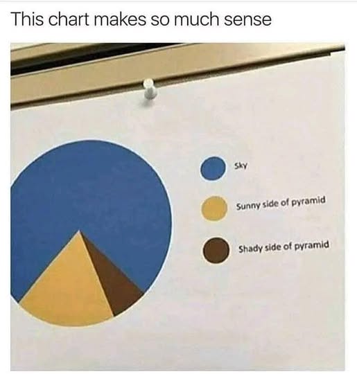
Pie Charts
Pie charts often get a lot of criticism for being hard to read. However, they can be useful for showing part-to-whole relationships when there are a small number of categories (n<5).
- Best for
- 1 dimension (a category)
- 1 measure (a value showing % of whole)
- Pre-attentive attributes
- Angle
- Area
- Color (categorical)
- Limits
- Best for n<5
- Hard to visualize precise data
- Basic features
- Show labels with either % of total or actual value
Process:
- Drag a dimension onto Marks -> Color
- Drag a measure onto Marks -> Angle
- (If needed) Drag a measure onto Marks -> Label
- Change label to show either % of total or actual value