Introduction to Data Visualization
Nathan Garrett, PhD CPA
Refreshed 2025-01-27
This document goes with the in-class slide presentation titled “Introduction to Data Visualization”
Channels
We can map numbers to different visual channels (also called pre-attentive attributes).
- Position on a common scale
- Position on unaligned scale
- Length
- Tilt
- Area
- Color luminescence or brightness
- Color saturation or intensity
- Curvature
- Volume: one of the least accurate approaches
- Depth (3D): generally is best to avoid
In accuracy,
- Position (common scale, then stacked, and unaligned)
- Length (unstacked, then stacked)
- Angle (for pie charts)
- Area (rectangular is slightly better than circular)
Storytelling
Compare the mean (x) versus residuals (difference between mean and actual value).
Distributions can be normal (bell curve) or uniform (equally distributed), or skewed (more small or large). They can also have an increasing or decreasing spread. An outlier can throw off a pattern. Bimodal means that you have 2 normal curves overlapped. Categorical data shows up at only certain spots.
Tables
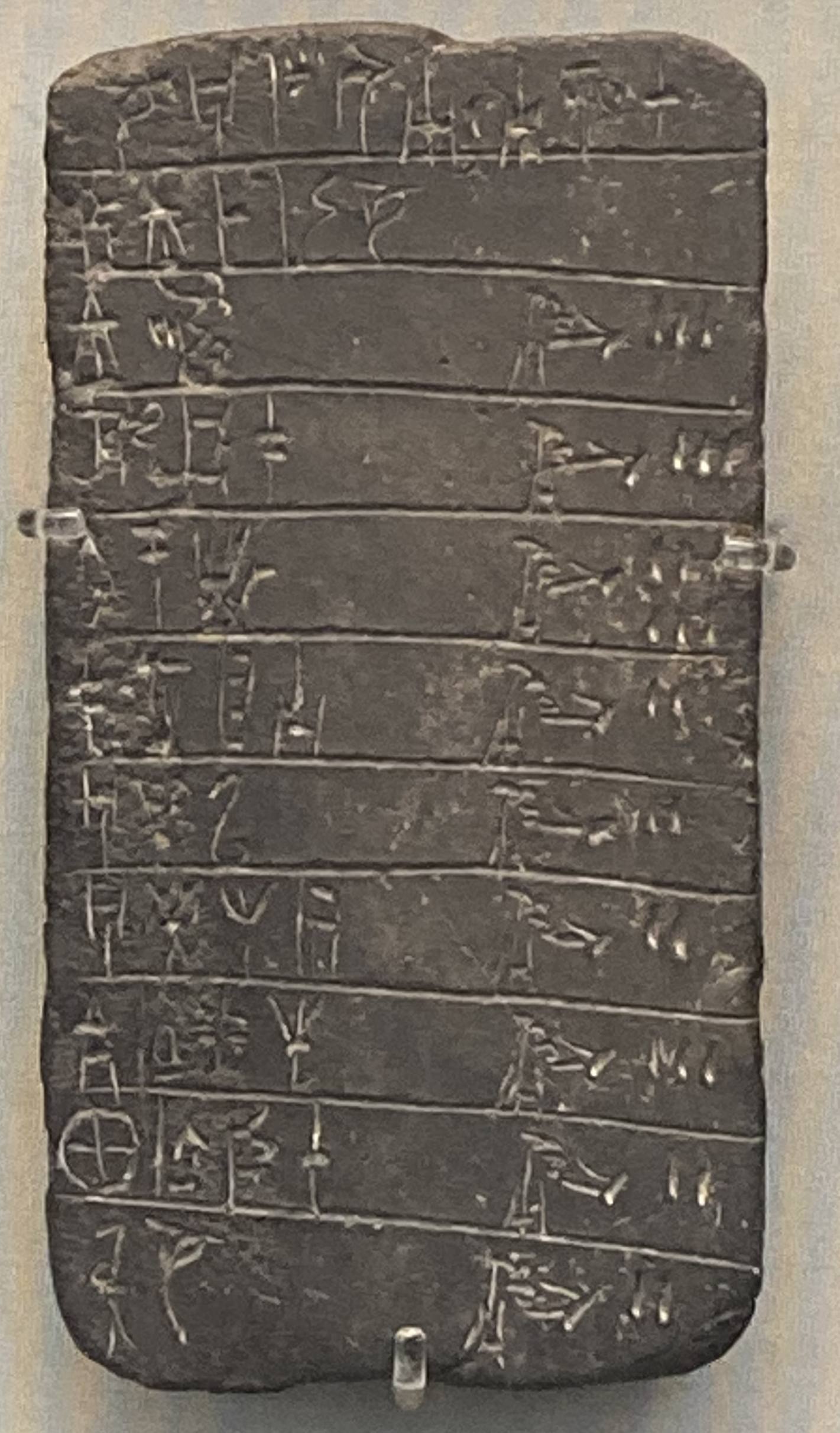
Tables are not charts! A chart is a data mapped to a visual element (such as size or height). In contrast, a table has rows and columns with numbers.
Tablet from 13th century BC, showing inventory of shepherds &
herds. Linear B, palce of Pylos. Image taken by Nathan Garrett, 2024.
