EDA
EDA in R - Introduction
This corresponds to the DataCamp Exploratory Data Analysis in R course.
It helps us understand how multiple variables are related to each other.
Concepts
Marginal: the chance that of an event happening.
Example: what are the chances of a heads on a coin flip, given that we
had just had a head. It is still 50%.
Conditional: If A, then the proportion of B changes.
Example: If a person is a man, then they are more likely to be tall.
Step 1: Understand your data
Check field types and values
First we want to make sure that we understand our data. Begin by visually scanning the table.
Then, use some functions to show what values are present in the data.
library(tidyverse)
t <- tibble(x = 1:10, y = rep(c('A', 'B'), 5) )

# Show the field types
str(t)
## tibble [10 × 2] (S3: tbl_df/tbl/data.frame)
## $ x: int [1:10] 1 2 3 4 5 6 7 8 9 10
## $ y: chr [1:10] "A" "B" "A" "B" ...# Show a summary of the values
summary(t)## x y
## Min. : 1.00 Length:10
## 1st Qu.: 3.25 Class :character
## Median : 5.50 Mode :character
## Mean : 5.50
## 3rd Qu.: 7.75
## Max. :10.00# Alternatively, this is a better way of showing if you have a lot of variables
# It uses the map function to apply summary to each field in t
# map(t, summary)# Useful for categorical variables and getting a breakdown of the values
table(t$y)##
## A B
## 5 5# Also useful is unique(t$y)Visualize Categorical data
Categorical data is generally stored as text values. They can be encoded with numbers, but there should be no significance to the range between different values.
Examples of categorical data would be:
- Gender (m/f)
- State (WV, CA, …)
- Grade level
- Zipcode
Clean unique values
Start by evaluating for bad categories or na values.
library(tidyverse)

# Bad tibble
t_raw <- tibble(
            person = c('Bob', 'Bob', 'Bob', 'Sue', 'Sue', NA, 'Su'),
            group = c('Group A', 'Group B', 'A', 'a', 'b', NA, ''))

# Fixes stored as data, rather than code.
t_fix = tibble(
  from = c('Group A', 'Group B', 'A', 'a', 'b' ),
  to = c('a', 'b', 'a', 'a', 'b')
)

# Simple fixes
#
# Clean up with filter / mutate
# Use !is.na to only return fields with values
# Use "" to filter for blank fields
# Use mutate and ifelse to convert from bad values to good values
t1 <- t_raw %>%
  filter(!is.na(person),
         !is.na(group),
         group != '') %>%
  mutate(person = ifelse(person == 'Su', 'Sue', person))

# Join fix
t2 <- t1 %>%
  left_join(t_fix, by = c('group' = 'from')) %>%
  mutate(group = to,
         to = NULL)

print(t2)
## # A tibble: 5 × 2
## person group
## <chr> <chr>
## 1 Bob a
## 2 Bob b
## 3 Bob a
## 4 Sue a
## 5 Sue bFind unique items and counts
Remove or group low-count items. View both absolute count and proportions
library(tidyverse)

# Change printout to simplify output
options(scipen = 999, digits = 3)

t <- tibble(x = c('Bob', 'Bob', 'Bob', 'Sue', 'Sue', 'Dave', 'Bob'),
            region = c('A', 'B', 'B', 'A', 'A', 'B', 'C'))

# Print normal table
table(t$x, t$region)
##
## A B C
## Bob 1 2 1
## Dave 0 1 0
## Sue 2 0 0# remove
t_fixed <- t %>%
filter(!x %in% c('Dave', 'Bob'))
# Print table of % (of total)
# For 2nd argument,
# NA: % of total
# 1: % of row
# 2: % of column
prop.table(table(t$x, t$region))##
## A B C
## Bob 0.143 0.286 0.143
## Dave 0.000 0.143 0.000
## Sue 0.286 0.000 0.000Convert text into numeric variables
Convert textual values into numbers, where it makes sense with the underlying data.
library(tidyverse)

# Bad tibble
t_raw <- tibble(
            sales_rank = c('Rank 1', 'Rank 2', 'Rank 3'),
            level = c('a', 'b', 'c')
          )

# Conversion table or ifelse
t_fix = tibble(
  from = c('a', 'b', 'c'),
  to = 1:3
)

t1 <- t_raw %>%
  mutate(sales_rank = as.numeric(substr(sales_rank, 6, 6)))

# Join fix
t2 <- t1 %>%
  left_join(t_fix, by = c('level' = 'from')) %>%
  mutate(level = to,
         to = NULL)

print(t2)
## # A tibble: 3 × 2
## sales_rank level
## <dbl> <int>
## 1 1 1
## 2 2 2
## 3 3 3Charts
Bar charts are very useful for categorical data. You can show the basic value as the x or the y, and then use color or facets to break down further categories.
library(tidyverse)

t <- tibble(person = c('Bob', 'Bob', 'Bob', 'Sue', 'Sue', 'Sue', 'Bob'),
            region = c('A', 'B', 'B', 'A', 'A', 'B', 'B'),
            year = c(1, 1, 1, 1, 2, 2, 2))

ggplot(data = t) +
  geom_bar(mapping = aes(x = person, fill = region)) +
  facet_wrap( ~ year)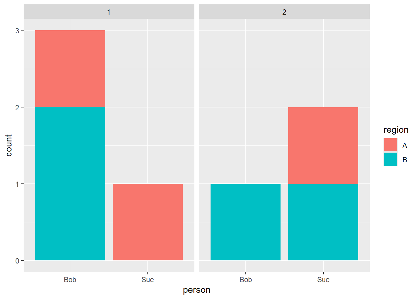
Vizualize Continuous data
Continuous data is numeric information, where the difference between values is meaningful. You can typically measure this data at different levels of precision (ie., age in years, age in months, age in days, …)
Examples:
- Weight
- Price
- Height
Remove outliers
We often have to clean up values.
Start by looking at the data with a histogram to get a general idea of its shape. Think about if it appears to have a normal distribution.
You may have to eliminate outlier values, or add a log transform to the data.
library(tidyverse)

# Generate a normal distribution of data
t_raw <- tibble(id = 1:100,
                height_in_inches = rnorm(n = 100, mean = 5.5*12, sd = 12))

# Eliminate outlier values
t <- t_raw %>%
  filter(height_in_inches > 50,
         height_in_inches < 90)

# Or, set outlier values to a max or min value to avoid removing them from the dataset.
t <- t_raw %>%
  mutate(height_in_inches = ifelse(height_in_inches < 50, 50, height_in_inches),
         height_in_inches = ifelse(height_in_inches > 90, 90, height_in_inches))


ggplot(data = t) +
  geom_histogram(mapping = aes(x = height_in_inches))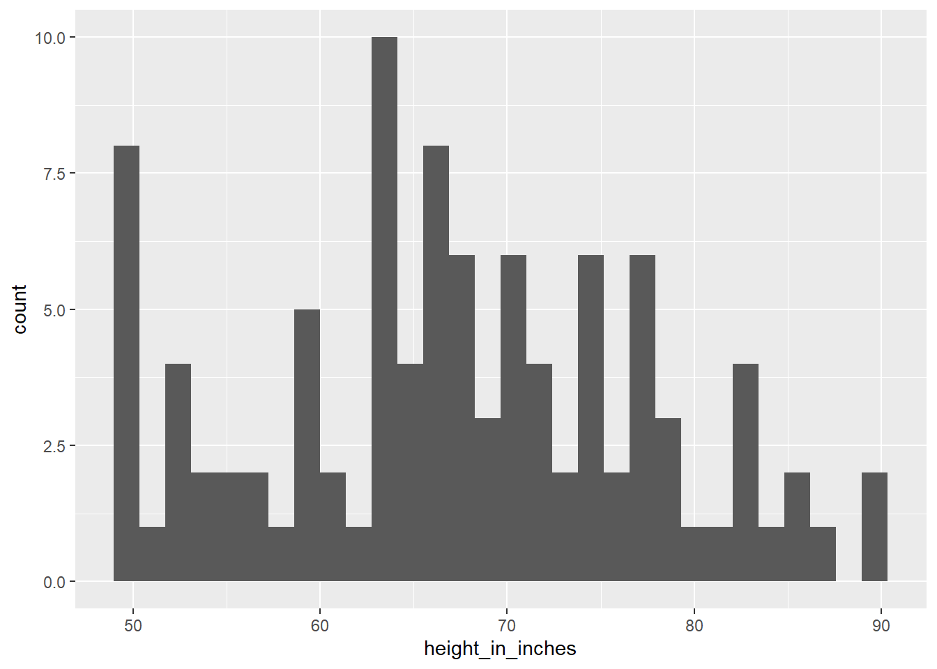
Zero-inflation strategy
We often have issues with variables having a lot of zeros. We can convert that into a yes/no variable. Sometimes it is more important to have a yes/no variable than an actual amount.
library(tidyverse)

# Generate a normal distribution of data
t_raw <- tibble(person_id = 1:10,
                amount_won_in_game = c(0, 0, 0, 0, 0, 100, 200, 140, 20, 0))

# Create yes/no
t <- t_raw %>%
  mutate(winner01 = ifelse(amount_won_in_game > 0, 1, 0))

table(t$winner01)
##
## 0 1
## 6 4Step 2: Correlations
We typically want to understand cause and effect in our dataset.
Correlation
cor
Cause/effect is typically started with some type of correlation table. However, we have to be careful about blinding trusting this table. It can be very misleading, as well as require some setup.
library(tidyverse)

t_raw <- tibble(x = c(0,0,0,0,0,0, 1, 1, 1, 1, 1, 1 ),
            y = c(10, 10, 9, 8, 7, 9, 10, 100, 20, 100, 80, 28),
            region = rep(c('A', 'B'), times = 6))

# Fix region by converting it into a 01 value.
t <- t_raw %>%
  mutate(regionA01 = ifelse(region == 'A', 1, 0))

# It's usually good to make a tibble for the cor test with only numeric values
t_numbers <- t %>%
  select(where(is.numeric))

# Show all figures
cor(t_numbers)
## x y regionA01
## x 1.000 0.663 0.000
## y 0.663 1.000 -0.277
## regionA01 0.000 -0.277 1.000cor.test
The cor.test function will show the statistical significance of any correlations you find.
library(tidyverse)

t_raw <- tibble(x = c(0,0,0,0,0,0, 1, 1, 1, 1, 1, 1 ),
            y = c(10, 10, 9, 8, 7, 9, 10, 100, 20, 100, 80, 28),
            region = rep(c('A', 'B'), times = 6))

# Fix region by converting it into a 01 value.
t <- t_raw %>%
  mutate(regionA01 = ifelse(region == 'A', 1, 0))

# It's usually good to make a tibble for the cor test with only numeric values
t_numbers <- t %>%
  select(where(is.numeric))

# Show the correlation's statistical significance
cor.test(t_numbers$x, t_numbers$y)
##
## Pearson's product-moment correlation
##
## data: t_numbers$x and t_numbers$y
## t = 3, df = 10, p-value = 0.02
## alternative hypothesis: true correlation is not equal to 0
## 95 percent confidence interval:
## 0.143 0.896
## sample estimates:
## cor
## 0.663Correlation chart
ggcorrplot is a nice library for printing correlation tables
library(tidyverse)
library(ggcorrplot)

t_raw <- tibble(x = c(0,0,0,0,0,0, 1, 1, 1, 1, 1, 1 ),
            y = c(10, 10, 9, 8, 7, 9, 10, 100, 20, 100, 80, 28),
            region = rep(c('A', 'B'), times = 6))

# Fix region by converting it into a 01 value.
t <- t_raw %>%
  mutate(regionA01 = ifelse(region == 'A', 1, 0))

# It's usually good to make a tibble with only numeric values
t_numbers <- t %>%
  select(where(is.numeric))

# Show the correlation's statistical significance
ggcorrplot(cor(t_numbers),
           colors = c('red', 'white', 'blue'))
Plot Correlations
Point Chart (continuous, n < 100)
After we see a connection between our variables, you should plot the relationship.
Point plots are pretty good for small to mid-size datasets. However, we will get issues with overplotting. There are two general mitigations:
- Set alpha to a low value
- Add jitter
library(tidyverse)

# Generate a normal distribution of data
t <- tibble(height_in_feet = round(rnorm(n = 100, mean = 5, sd = 1), 0),
            weight_in_lbs = round(rnorm(n = 100, mean = 150, sd = 20), -1),
            )

ggplot(data = t) +
  geom_point(mapping = aes(x = jitter(height_in_feet, factor = 1.1),
                           y = weight_in_lbs),
             alpha = 0.1)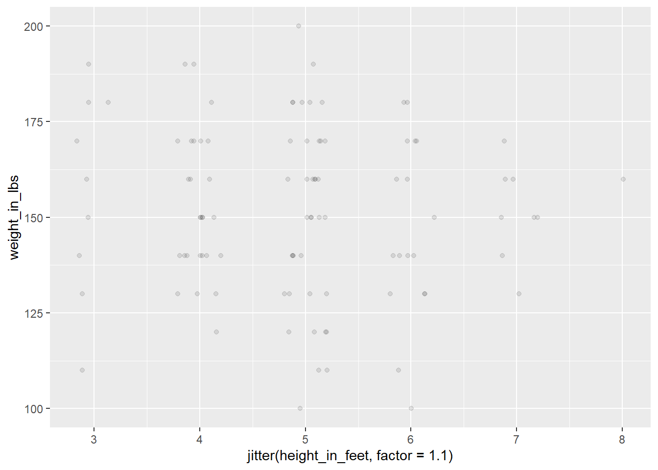
Density Chart (categories, n > 200)
At a certain point, you should shift to a density plot, which is basically a nicer histogram.
library(tidyverse)

# Generate a normal distribution of data
t <- tibble(height_in_feet = round(rnorm(n = 100, mean = 5, sd = 1), 0),
            category = rep(x = c('A', 'B'), time = 50))

# Make the plot more interesting by changing group A
t <- t %>%
  mutate(height_in_feet = ifelse(category == 'A', height_in_feet + 1, height_in_feet - 1))

ggplot(data = t) +
  geom_density(mapping = aes(x = height_in_feet,
                             fill = category),
               alpha = .5)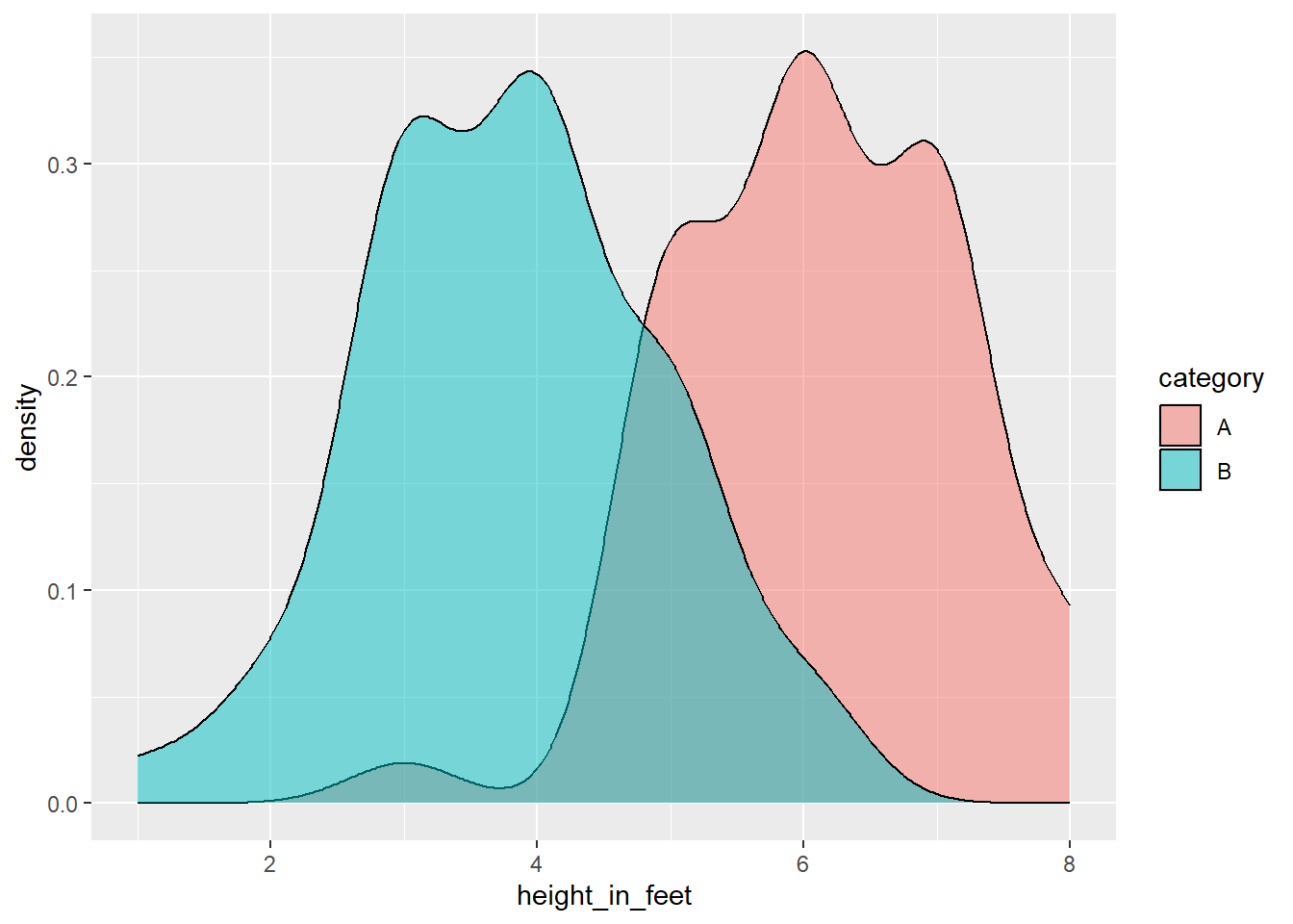
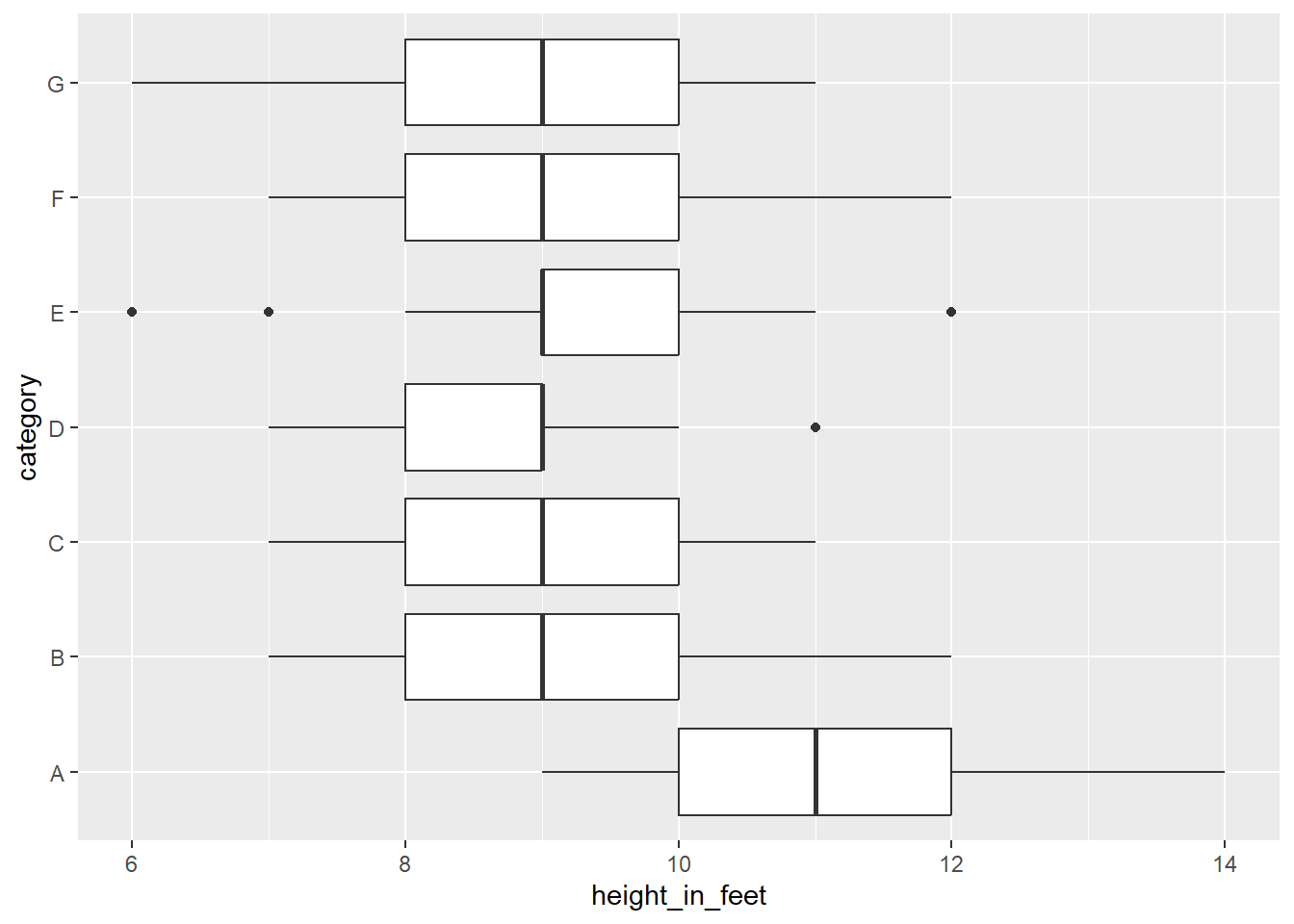
Boxplot Chart (categories, n > 2,000)
At a certain point, you should shift to boxplots. Add both a x and y scale, and use facets as needed.
library(tidyverse)

# Generate a normal distribution of data
t <- tibble(height_in_feet = round(rnorm(n = 700, mean = 10, sd = 1), 0),
            category = rep(x = c('A', 'B', 'C', 'D', 'E', 'F', 'G'), time = 100))

# Make the plot more interesting by changing group A
t <- t %>%
  mutate(height_in_feet = ifelse(category == 'A', height_in_feet + 1, height_in_feet - 1))

ggplot(data = t) +
  geom_boxplot(mapping = aes(x = height_in_feet,
                             y = category))