ggplot 1 - introduction
Introduction
ggplot is a super useful graphics tool. See its website at tutorial
This tutorial also supports Datacamp’s Introduction to Data Visualization with ggplot2.
Datacamp makes a distinction between two types of graphs:
- Exploratory: data-heavy charts to help a specialist or researcher understand their data.
- Explanatory: cleaner / simpler charts for common readers.
Ggplot elements
There are number of key layers in a ggplot.
- data
- geometries are shapes (point, line, ..)
- aesthetics map our data to shape properties (size, x-axis, …)
- Note that these aren’t attributes! Attributes are things assigned to a constand value, not our data.
- statistics let us change how geometries respond to data, such as showing one shape per row, one shape per sum of rows, etc…
We also have several other types of things:
- themes are color/style defaults
- coordinates help us map geometries to a space (cartesian, polar, …)
- scales show us numbers along an axis
- facets plot small multiples (columns, rows)
Geoms for 1-2 variables
There are different types of geoms:
geom_bar
A bar plot will show the count of items at every point in an axis (either x or y).
Note that we use + to join it with ggplot.
We need to add a mapping argument to geom_bar, and will use an aesthetic (aes). This allows us to define which parts of the chart will map to our dataset.
Minimal example
Map a field to either x or y. The axis other will be the
count (i.e., number of rows).
library(tidyverse)## Warning: package 'ggplot2' was built under R version 4.3.3# Minimal example
ggplot(data = mpg) +
geom_bar(mapping = aes(y = hwy)) # or x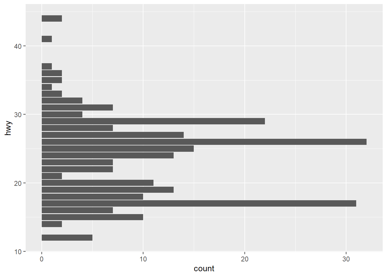
More options
Any properties that don’t map to the aes (data set) need
to be placed outside of the mapping argument.
- fill: bar color
- color: border color
library(tidyverse)

# Example with color/fill
ggplot(data = mpg) +
  geom_bar(mapping = aes(x = hwy),
           color = 'blue',
           fill = 'green')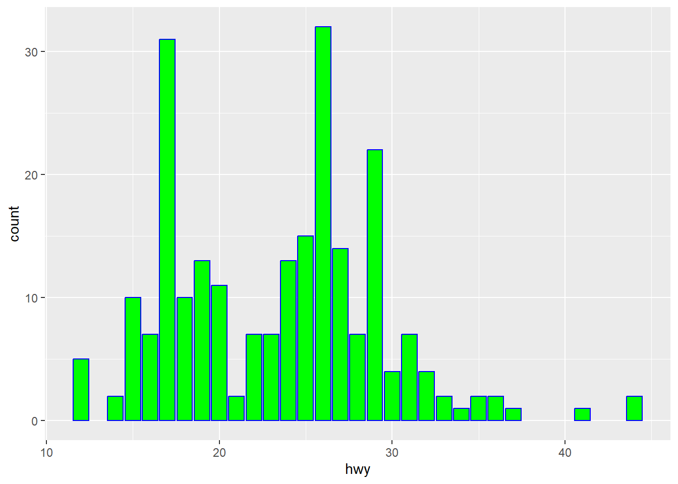
geom_col alternative
A bar plot can also show specific values (instead of
count). A geom_col is the same as
geom_bar, except for a default stat of
“identity”. Geom_bar uses count (i.e., the number of rows
matching the dimension).
library(tidyverse)

t_identity <- tibble(
  state = c('tx', 'ca', 'wv'),
  sales = c(100, 120, 70)
)


# Minimal example
#
#
# Alternatively, we can use a bar with stat set to identity
# ggplot(data = t_identity) +
#    geom_bar(mapping = aes(x = state, y = sales), stat = 'identity')
#
ggplot(data = t_identity) +
  geom_col(mapping = aes(x = state, y = sales))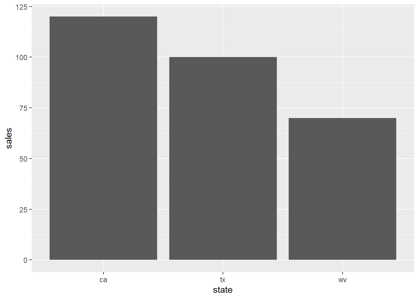
geom_smooth
The smooth geom shows a smoothed line. It shows the average value at each point. Error bars are shown in gray.
Minimal example
We need x and y values.
library(tidyverse)

# Show with error bars
ggplot(data = mpg) +
  geom_smooth(mapping = aes(y = hwy, x = cty))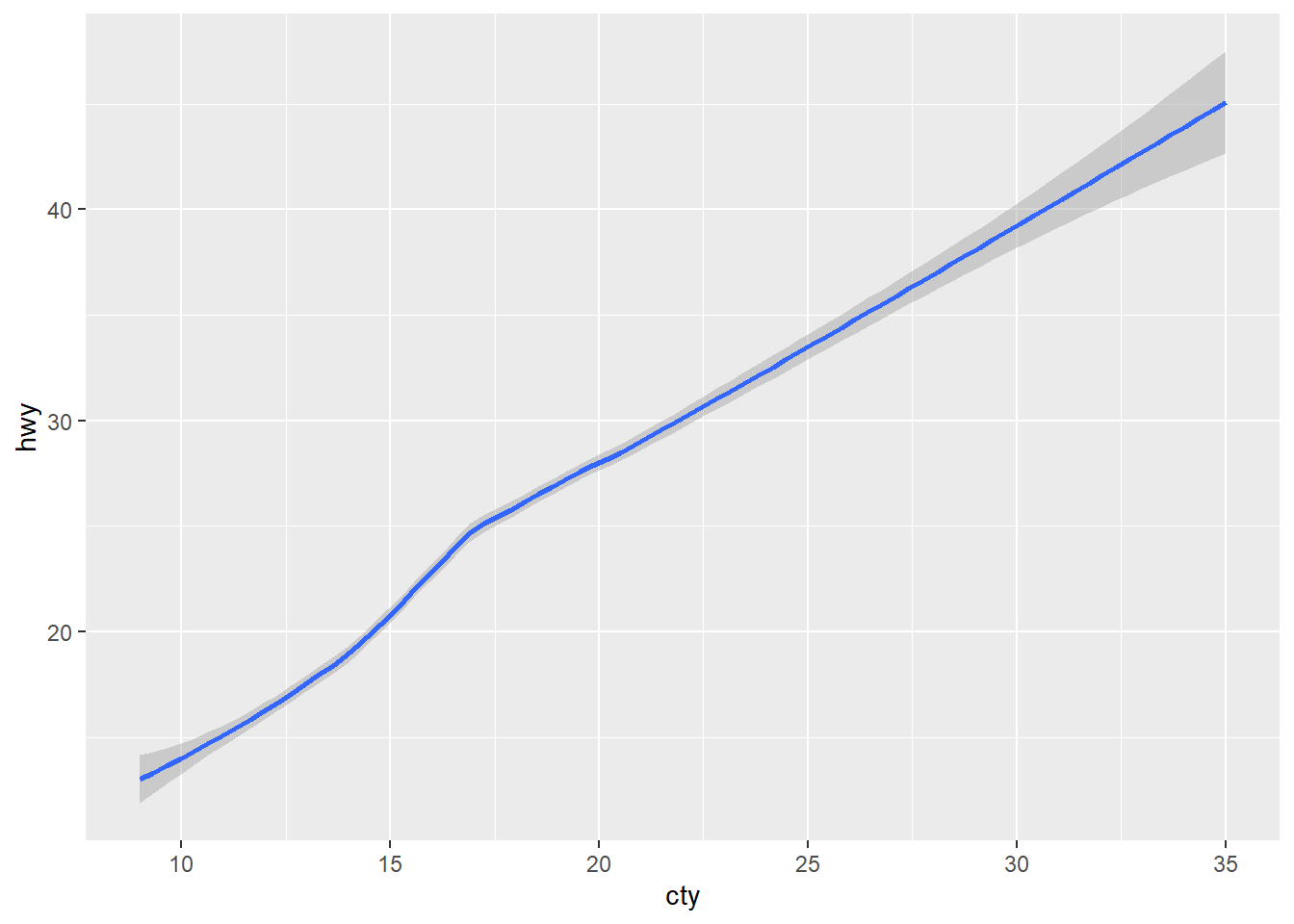
More options
library(tidyverse)

# Full example
# method: loess is default for small items. Can also use lm (linear reg)
# color: line color (as a string value)
# linewidth: width for the bar (number)
# se: FALSE to remove error bars (confidence interval around smooth)
# na.rm: TRUE to remove na values with no error
# stat: default is 'smooth' (shows a smoothed line). To show all items, use 'identity'.
ggplot(data = mpg) +
  geom_smooth(mapping = aes(y = hwy, x = cty),
              method = 'lm',
              na.rm = TRUE,
              stat = 'identity',
              se = FALSE,
              color = 'green',
              linewidth = 3)
geom_line alternative
This is identical to geom_smooth, but defaults to
showing the stat as identity, instead of smooth. This is similar to the
difference between geom_bar and geom_col.
# Show with error bars
ggplot(data = mpg) +
  geom_line(mapping = aes(y = hwy, x = cty))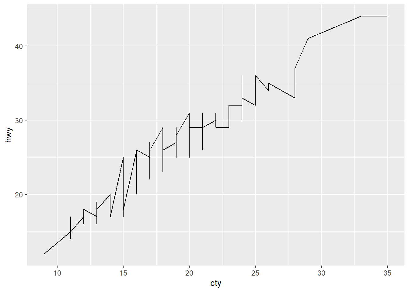
geom_point
This shows a separate dot for each row in the dataset (identity)
They are great for showing a large amount of data, but you typically will need to account for overlapping / overplotting data by changing the alpha or adding jitter.
Minimal example
library(tidyverse)

# Basic example
#   x and y: can be either categorical or numerical data
ggplot(data = mpg) +
  geom_point(mapping = aes(y = hwy, x = class))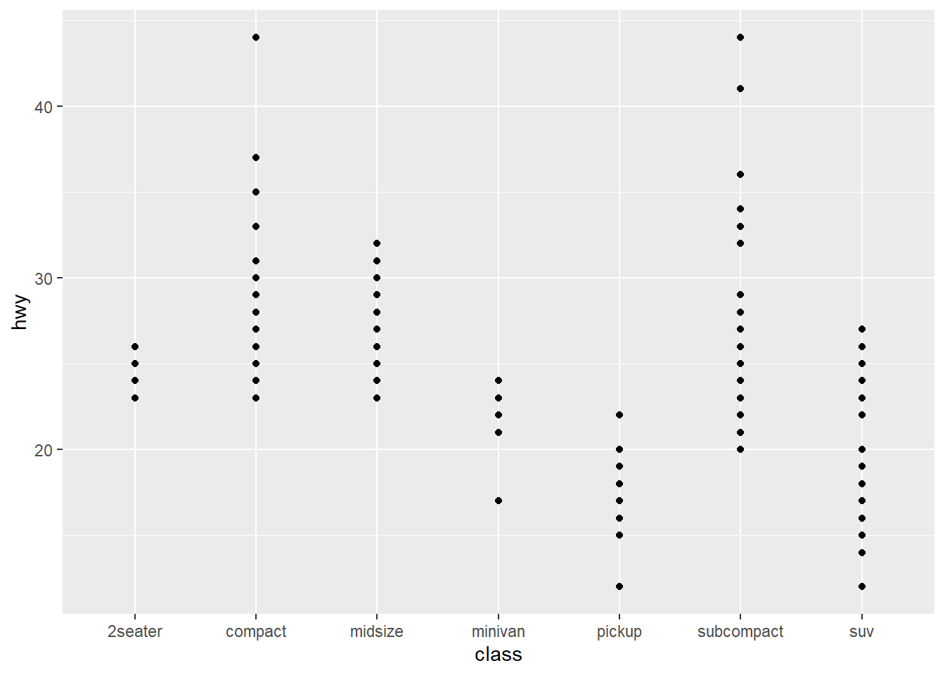
Mapping options
We can map a lot of different point properties to our tibble.
library(tidyverse)

# We have a lot of properties that can be mapped
#   shape: best discrete, (suggested max of 6 different items)
#   size: continuous value
#   alpha: continuous values
#   color: either continuous or discrete
ggplot(data = mpg) +
  geom_point(mapping = aes(y = hwy,
                           x = manufacturer,
                           shape = class,
                           size = cyl,
                           color = cty,
                           alpha = displ))
## Warning: The shape palette can deal with a maximum of 6 discrete values because more
## than 6 becomes difficult to discriminate
## ℹ you have requested 7 values. Consider specifying shapes manually if you need
## that many have them.## Warning: Removed 62 rows containing missing values or values outside the scale range
## (`geom_point()`).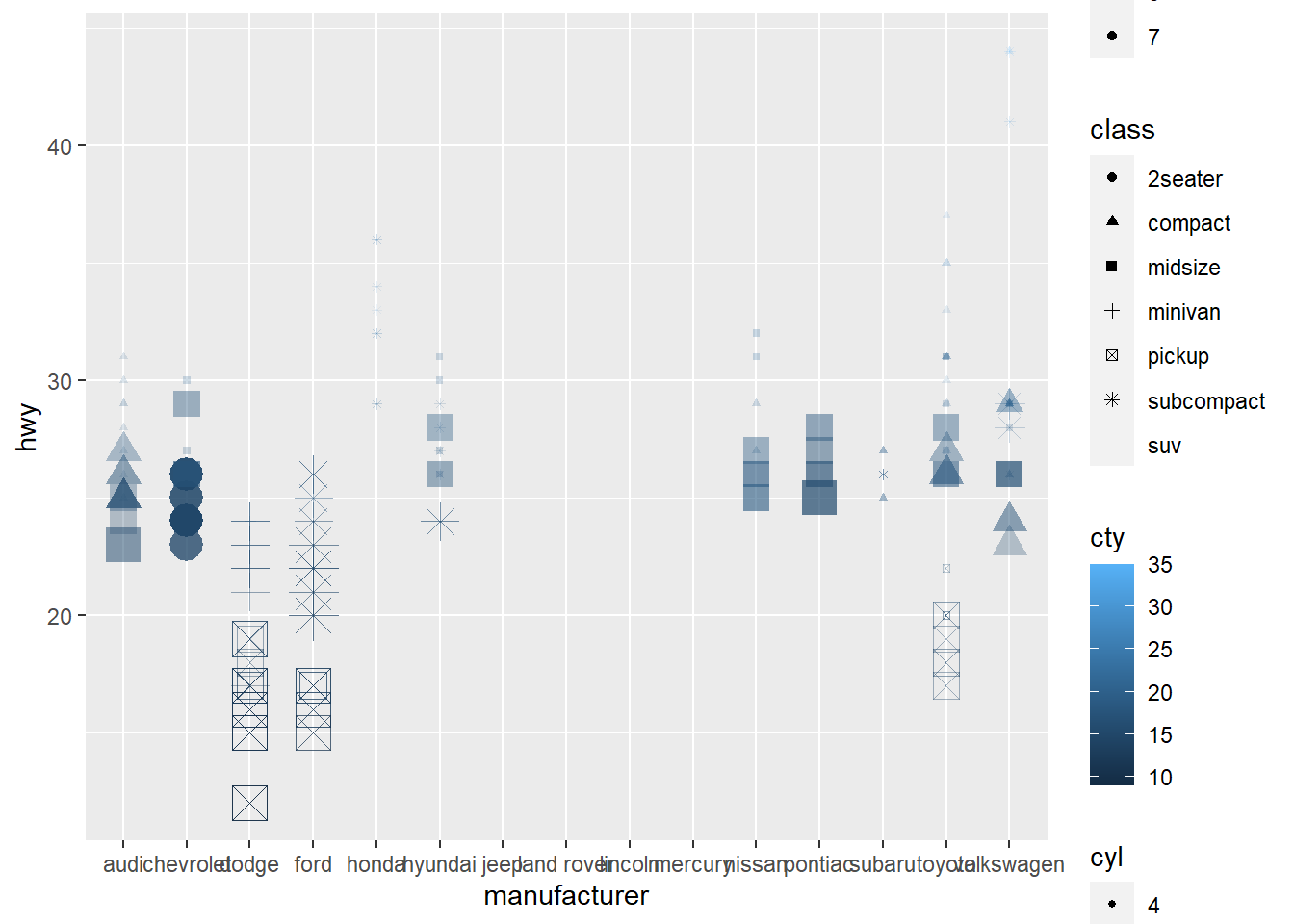
Formatting examples
We can also set individual values for each property (instead of mapping them to fields in our tibble).
library(tidyverse)

# Note that this can also be set manually
#   shape: Number, 1-20
#   size: Number
#   alpha: Number 0-1
#   color: Text, such as "black" or a hex code "#2211aa"
ggplot(data = mpg) +
  geom_point(mapping = aes(y = hwy,
                           x = manufacturer),
             shape = 2,
             size = 3,
             color = '#ffbbff',
             alpha = 0.9)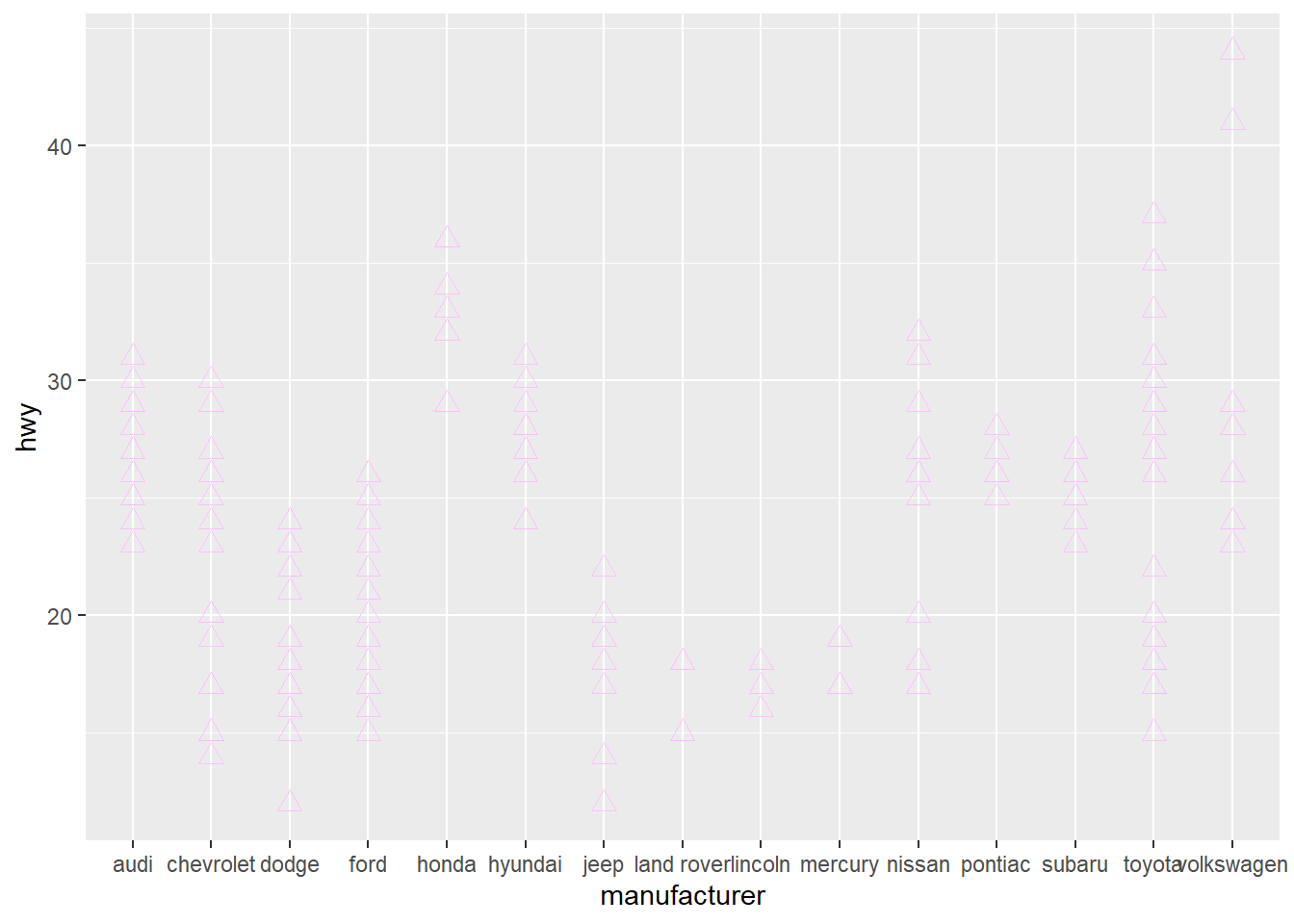
jitter
Another useful function combined with point is jitter.
This will slightly adjust the values given, making it easier to see over
plotted data (where we have a lot of different items with the same x and
y)
Use in combination with a low alpha value to see the density of points on your plot.
library(tidyverse)

# jitter takes in a variable, and adjusts it by the factor
# Note that it only works with continuous data
ggplot(data = mpg) +
  geom_point(mapping = aes(y = jitter(hwy, factor = 1.5),
                           x = manufacturer),
             alpha = 0.1)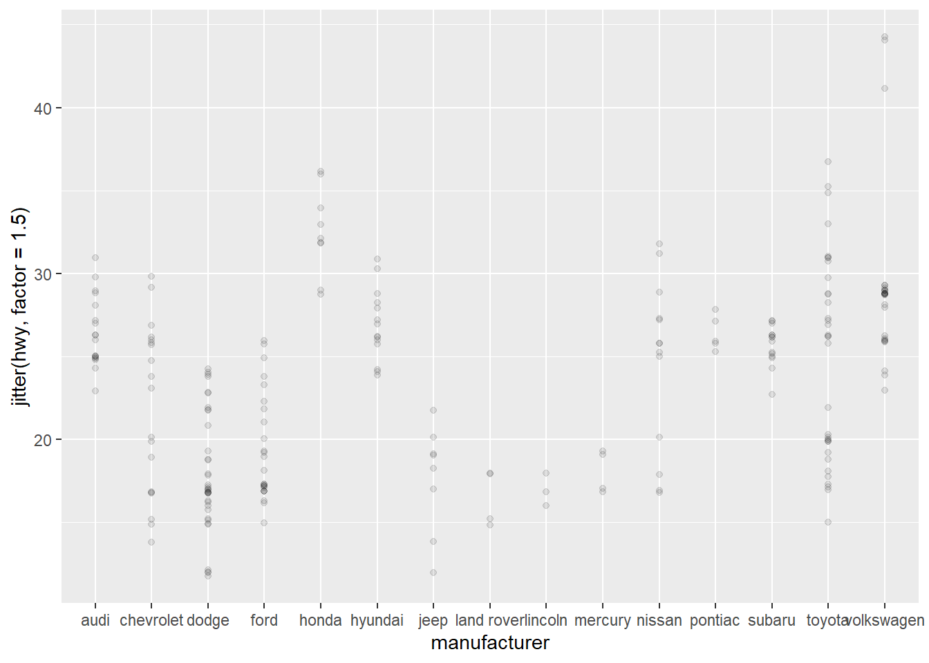
Geoms for distributions
geom_histogram
Show the count of items using bins
library(tidyverse)

ggplot(data = mpg) +
  geom_histogram(mapping = aes(x = hwy),
                 binwidth = 5)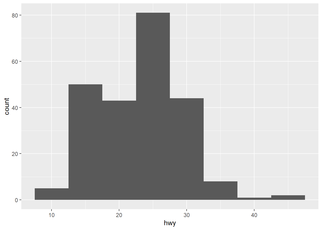
geom_density
Similar to a histogram, but you can layer different lines on top of each other.
library(tidyverse)

ggplot(data = mpg) +
  geom_density(mapping = aes(x =hwy, color = class, fill = class),
               alpha = 0.2)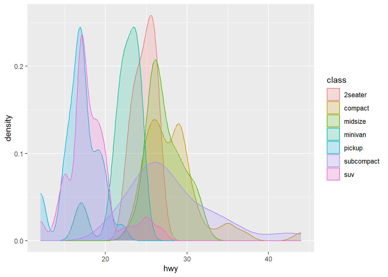
geom_boxplot
Show a boxplot for a series of discrete values (usually text)
library(tidyverse)

ggplot(data = mpg) +
  geom_boxplot(mapping = aes(x = class, y = hwy))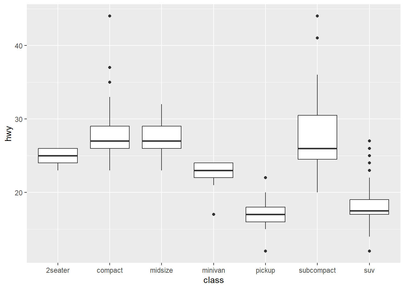
Facets
We can create multiple plots using facets
Small multiples (facets) are a great technique for exploring categorical data # and its relationship with continuous data.
Note the ~ symbol. ~ (tilde) is commonly use in lm (regression) to show [dependent variable] ~ [independent variable] For now, just remember to keep the left blank and put your category variable on the right.
facet_wrap
Show a separate plot for each categorical data
library(tidyverse)

# nrow says how many plots to put per row
ggplot(data = mpg) +
  geom_point(mapping = aes(x = displ, y = hwy)) +
  facet_wrap( ~ class, nrow = 3)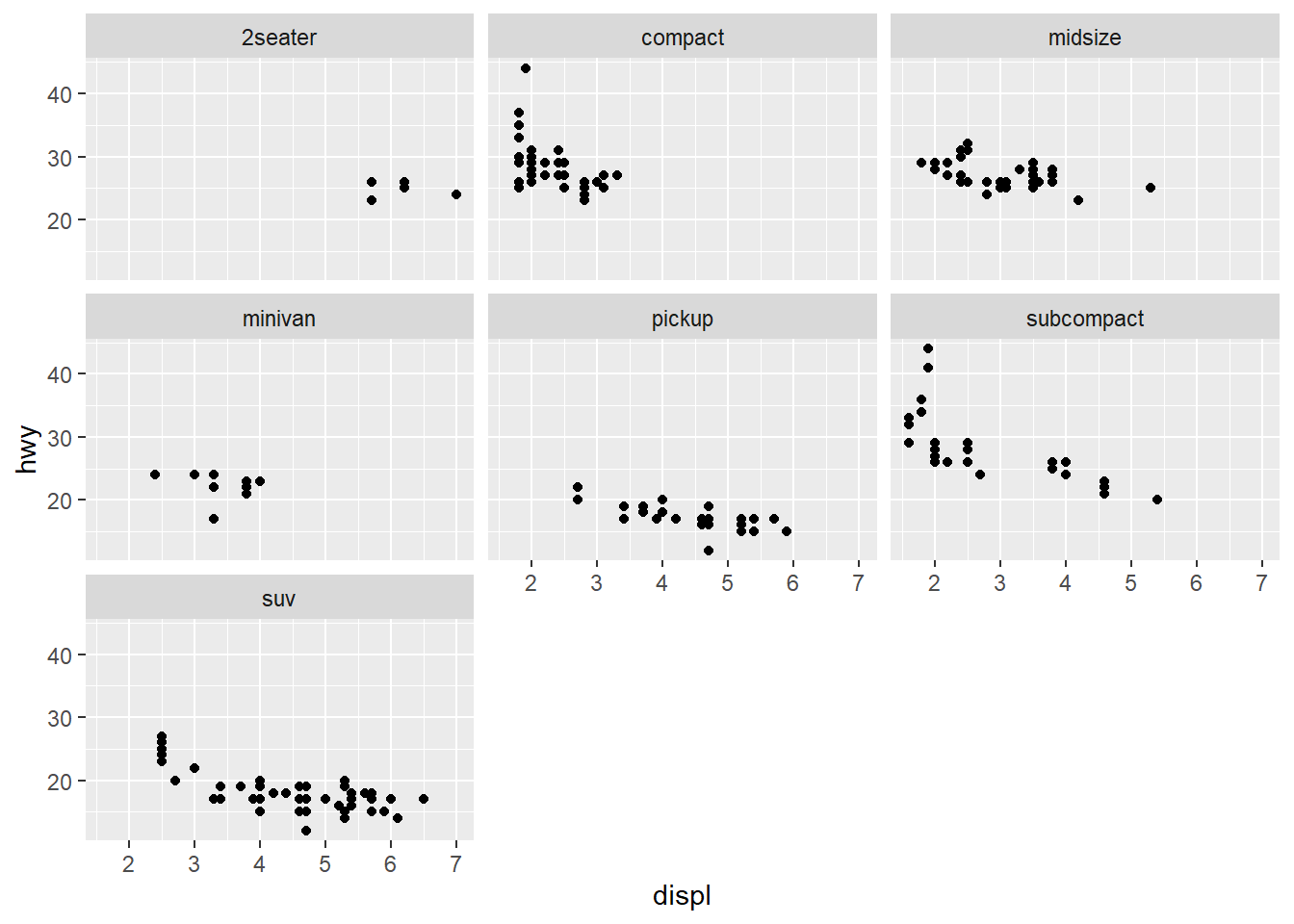
facet_grid
Show a grid of charts, using two continuous variables.
library(tidyverse)

# Small multiples (facets) can be used with two separate variables.
# Use facet_grid instead of facet_wrap.
# Use categorical variables.
# Note the ~  uses drv (type of drive-train) and cyl (cylinders)
ggplot(data = mpg) +
  geom_point(mapping = aes(x = displ, y = hwy)) +
  facet_grid(cyl ~ drv)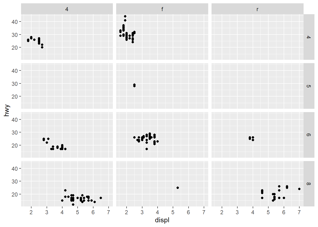
Dynamic plots
Plotly can be used to make a plot more dynamic. See its website for more information.
Other references
There is also a very nice cheat cheat by Afshine Amidi & Shervine Amidi
Here is a great systematic introduction: Elegant Graphics for Data Analysis
Here is a list of example charts: R Graphics Cookbook
Here is a great step-by-step tutorial: Show the right numbers