ggplot 2 - making a pretty plot
Introduction
This tutorial also supports Datacamp’s Introduction to Data Visualization with ggplot2.
It builds on the prior section by discussing ways to clean-up basic charts.
Geoms for annotations
geom_vline / geom_hline
Draw a line or box on the chart.
library(tidyverse)## Warning: package 'ggplot2' was built under R version 4.3.3## ── Attaching core tidyverse packages ──────────────────────── tidyverse 2.0.0 ──
## ✔ dplyr 1.1.4 ✔ readr 2.1.5
## ✔ forcats 1.0.0 ✔ stringr 1.5.1
## ✔ ggplot2 3.5.1 ✔ tibble 3.2.1
## ✔ lubridate 1.9.3 ✔ tidyr 1.3.1
## ✔ purrr 1.0.2
## ── Conflicts ────────────────────────────────────────── tidyverse_conflicts() ──
## ✖ dplyr::filter() masks stats::filter()
## ✖ dplyr::lag() masks stats::lag()
## ℹ Use the conflicted package (<http://conflicted.r-lib.org/>) to force all conflicts to become errorsggplot(data = mpg) +
geom_point(mapping = aes(x = cty, y = hwy)) +
geom_vline(xintercept = 20) +
geom_hline(yintercept = 30) +
geom_rect(xmin = 20, xmax = 25, ymin = 25, ymax = 30,
alpha = 0.005,
fill = 'green')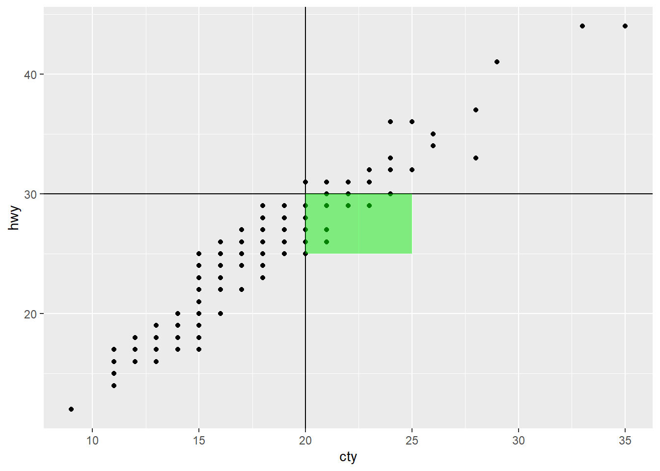
geom_label_repel
Add labels with geom_label_repel. There is also a geom_text, but it will plot labels on top of the data points.
library(ggrepel)

mpg_2seater <- filter(mpg, class == '2seater')

ggplot(data = mpg_2seater) +
  geom_point(mapping = aes(x = cty, y = hwy)) +
  geom_label_repel(mapping = aes(x = cty, y = hwy, label = model))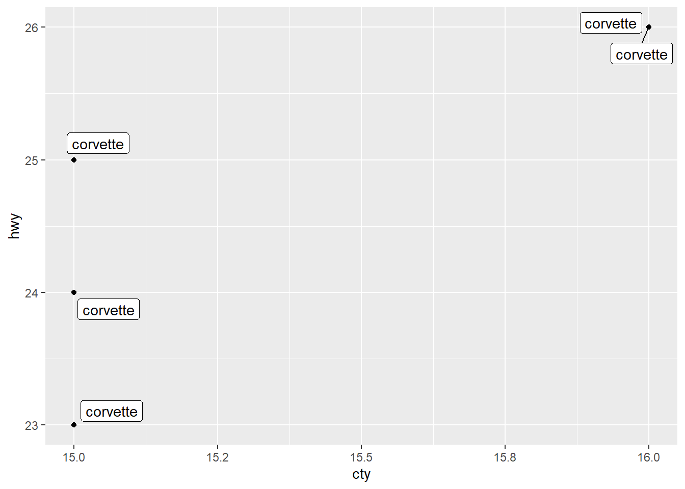
Labels
We can add a variety of labels to a plot.
ggplot(data = mpg) +
  geom_bar(mapping = aes(y = manufacturer)) +
  labs(title = 'Main title',
       subtitle = 'Subtitle title',
       caption = 'Caption at bottom of chart') +
  xlab('Label for x axis') +
  ylab('Label for y axis')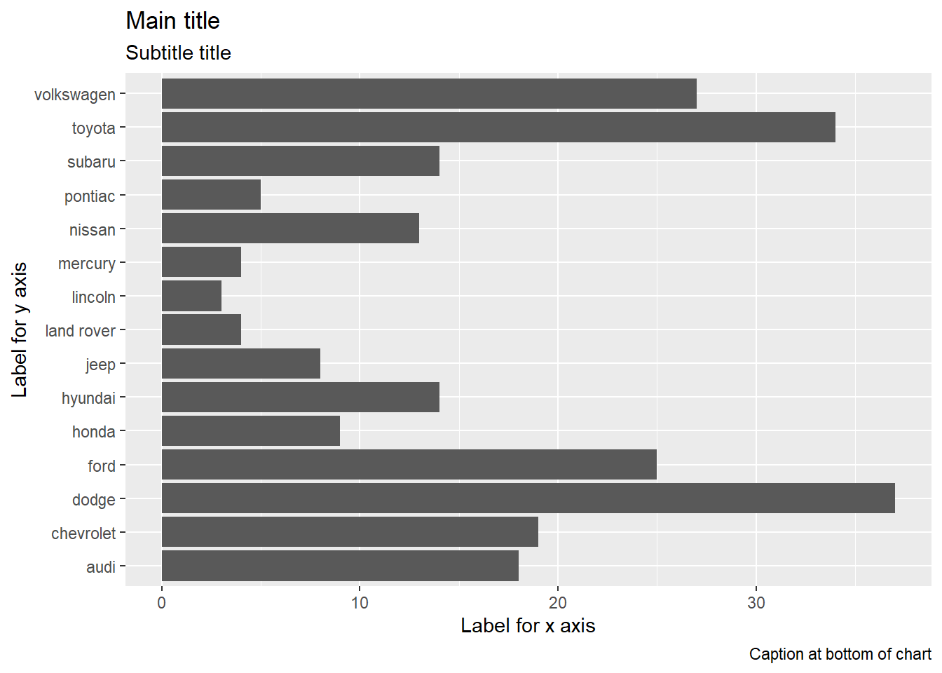
Theme
There are some nice options for themes. Some include:
- theme_gray (the default)
- theme_bw (good for transparency)
- theme_classic (traditional)
- theme_minimal
- theme_void (removes all but the data)
You can also find more themes in the ggthemes
package.
ggplot(data = mpg) +
  geom_point(mapping = aes(x = cty, y = hwy)) +
  theme_void()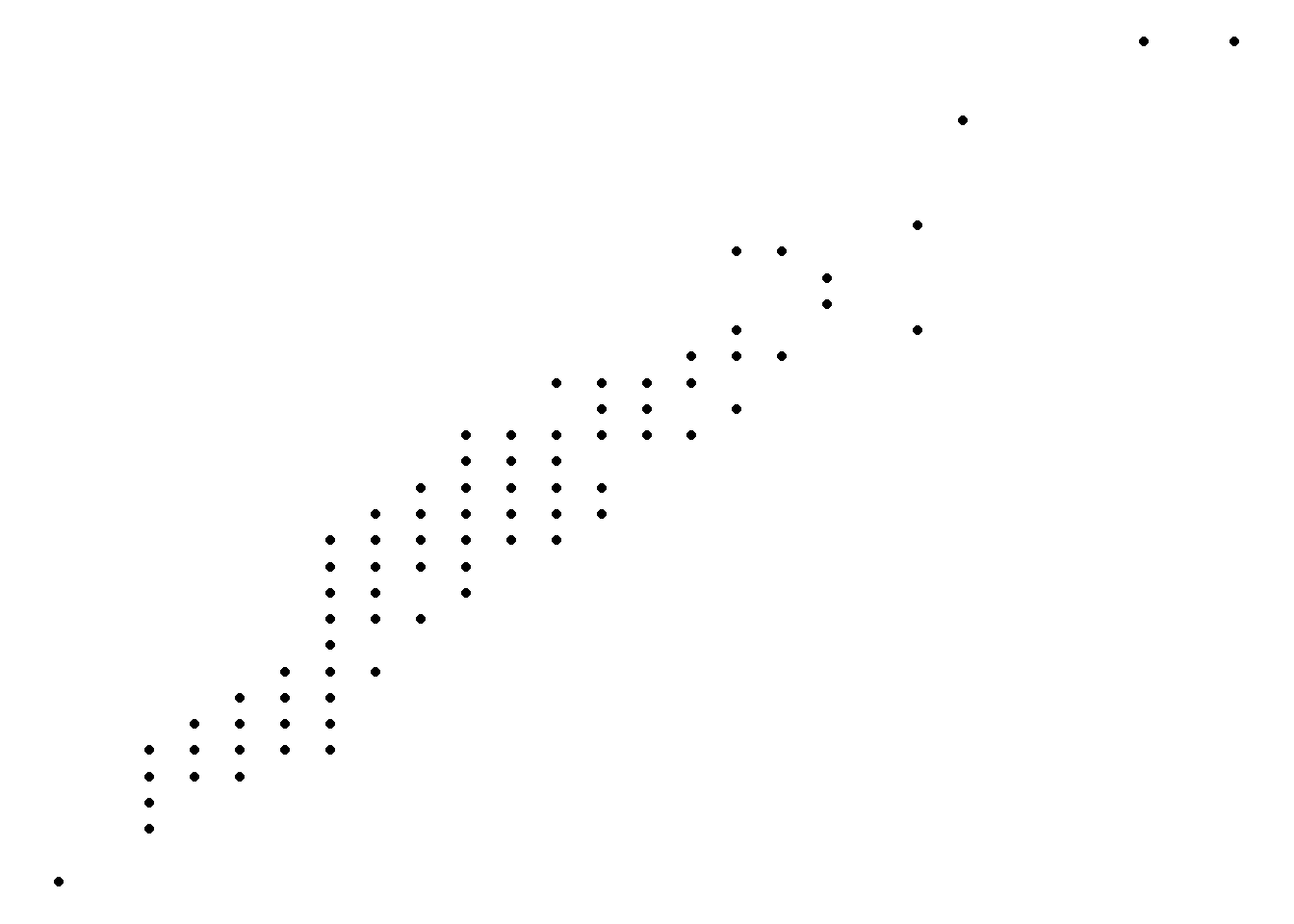
Limits
Set a max/min for an axis.
ggplot(data = mpg) +
  geom_point(mapping = aes(x = cty, y = hwy)) +
  xlim(0, 20) +
  ylim(0, 20)
## Warning: Removed 145 rows containing missing values or values outside the scale range
## (`geom_point()`).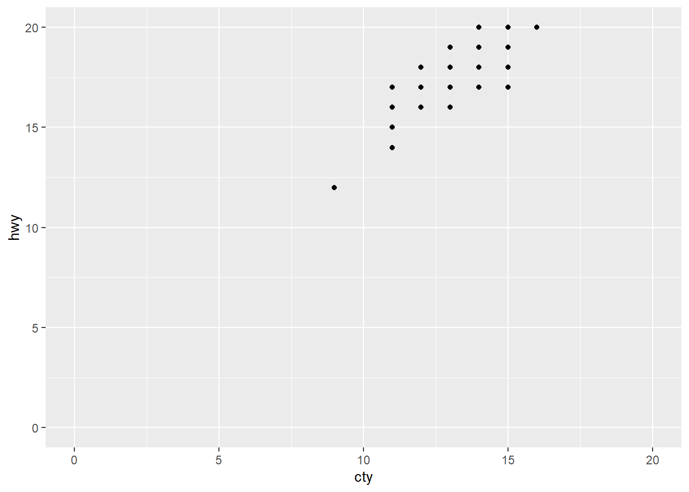
Scales
We can customize the axis scales.
You need to match the type of scale to your datatype. Is the data continuous (ie., a number) or discrete (generally text)?
Discrete Scale
A discrete scale handles a vector of text values. Set custom
labels using a vector.
ggplot(data = mpg) +
  geom_point(mapping = aes(y = class, x = hwy)) +
  scale_y_discrete(
                  labels = c('2 Seater', 'Compact Car', 'Midsize', 'Minivan',
                              'Pickup', 'Sub-compact', 'SUV'),
                  name = 'Car Classification')
Continuous Scale
A continuous scale is for a series of numbers.
We can set custom breaks, as well as the min/max.
ggplot(data = mpg) +
  geom_point(mapping = aes(y = hwy, x = hwy)) +
  scale_x_continuous(n.breaks = 5, limits = c(20, 30)) +
  scale_y_continuous(breaks = c(15, 20, 25))
## Warning: Removed 100 rows containing missing values or values outside the scale range
## (`geom_point()`).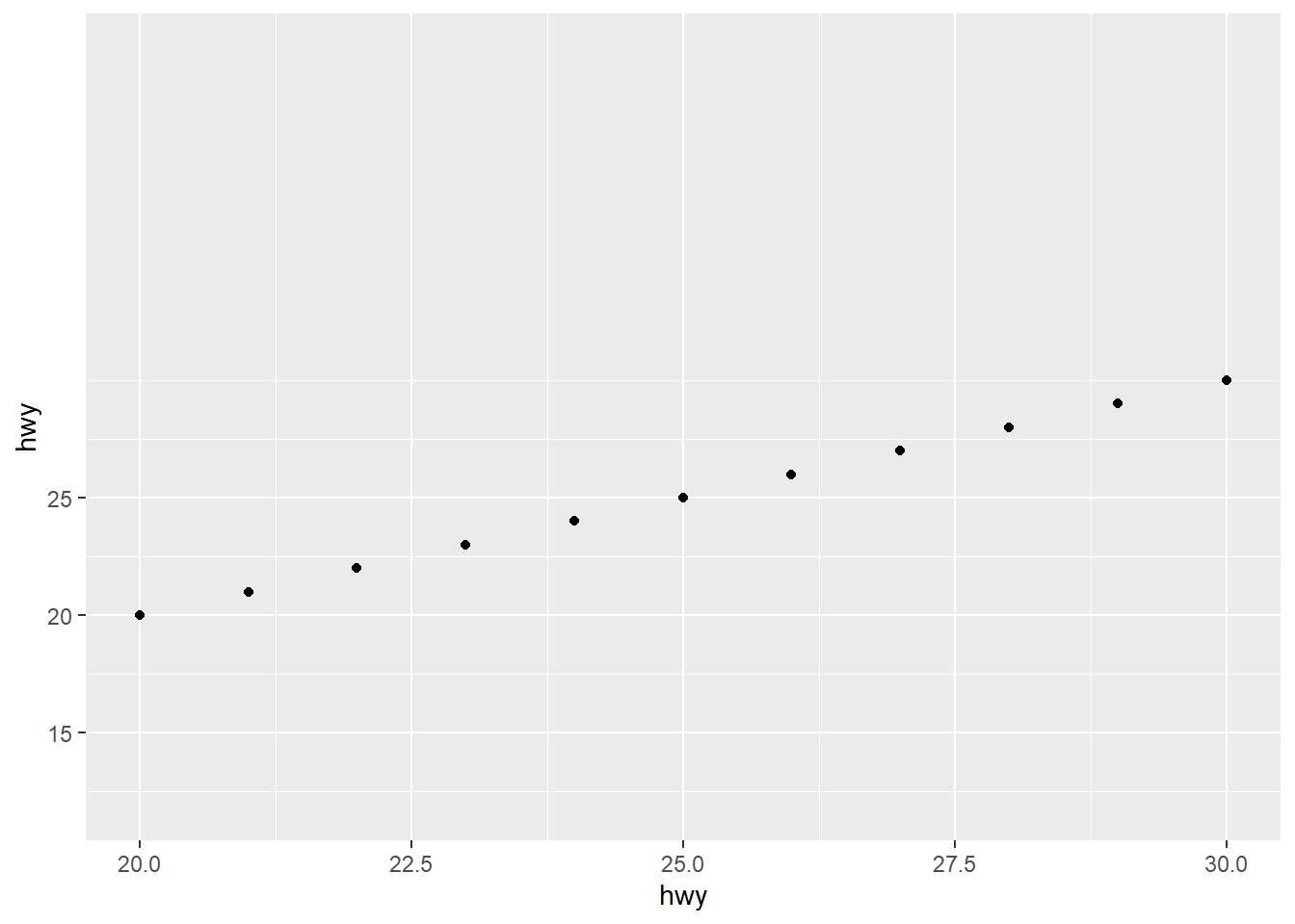
Log Scale
A log scale helps us see data that grows at an exponential level.
ggplot(data = mpg) +
  geom_point(mapping = aes(y = hwy, x = hwy)) +
  scale_x_log10()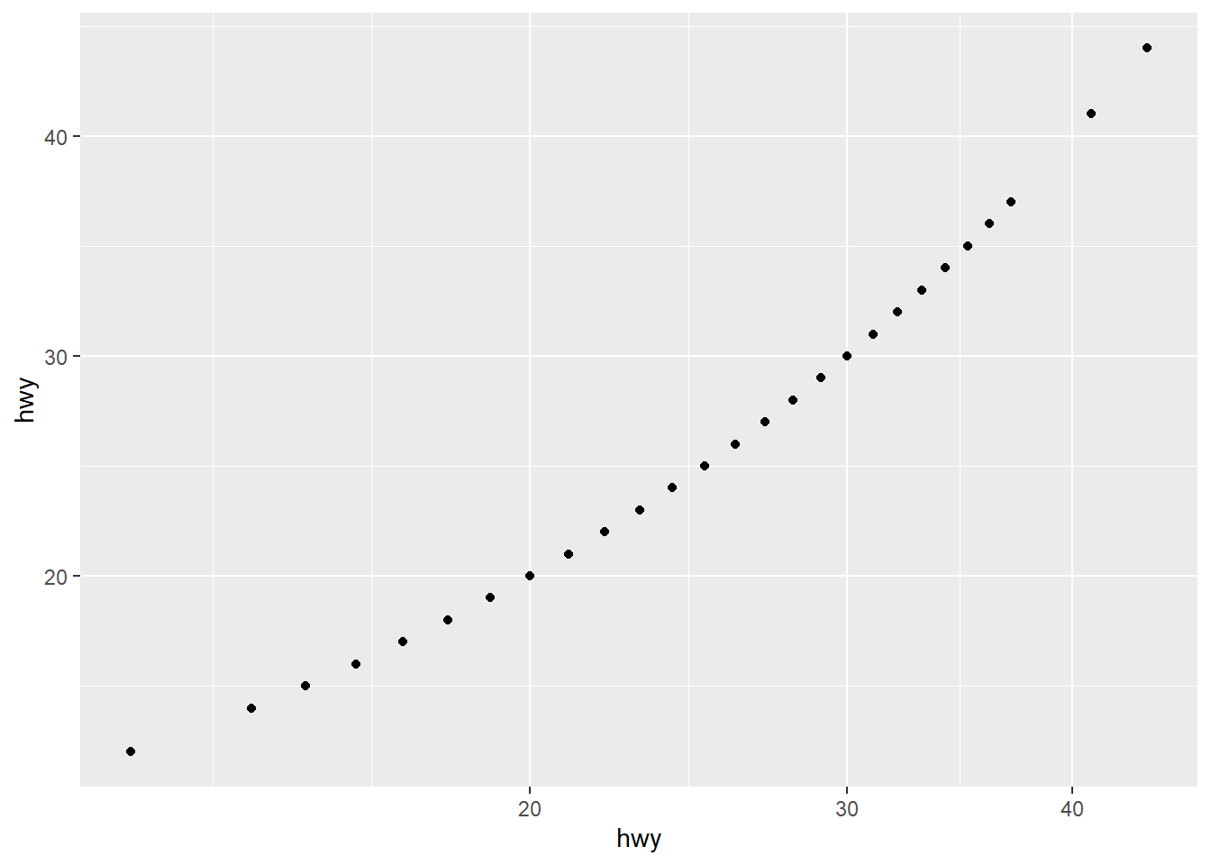
Date Scale
Dates/datetimes are continuous values, but don’t use a continuous
scale. Use scale_x_date and scale_x_datetime
for additional options.
Our main options are:
- Labels
labels = scales::label_date("format string")- Find
"format string"options by using F1 on label_date, and go to its format section, and click onstrptime(). Scroll down for a list of options. - Examples (note lower versus upper case!)
"%Y-%m-%d"shows as'2023-01-09'"%H:%M:%S"shows as'02:00:00'
- Find
- Breaks
date_breaks = "number periods""number period"is a combination of a number and a period (such as hour, minute, year, etc…)- Examples (use lowercase!):
1 month3 hours
- Limits
limits = c(start_date, end_end)- Create a date or datetime with lubridate
- Examples:
limits = c( ymd('2023-01-01'), ymd('2023-01-30'))`limits = c( ymd_hm('2023-01-01 06:00am'), ymd_hm('2023-01-01 06:00pm')
See ggplot’s label_date for help on the scale.
See lubridate for help on dealing with dates.
library(lubridate)

date_tibble <- tibble(
  open = c(ymd_hm('2023-01-01 8:00am'),
           ymd_hm('2023-01-02 9:00am'),
           ymd_hm('2023-01-09 3:30pm'),
           ymd_hm('2023-01-25 5:45pm'))
)

ggplot(data = date_tibble) +
  geom_point(mapping = aes(y = open, x = (open))) +
  scale_y_datetime(labels = scales::label_date("%Y-%m-%d"),
                   date_breaks = '1 week',
                   limits = c(
                     ymd_hm('2023-01-01 00:00'),
                     ymd_hm('2023-02-15 00:00'))
                   ) +
  scale_x_datetime(labels = scales::label_time("%H:%M:%S"),
                   date_breaks = '100 hours')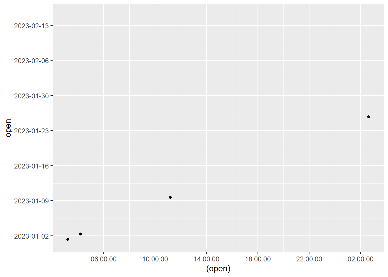
Breaks
Breaks also may need formatting to fix labels.
- label_percent(): show as 30%
- Use
accuracy = 0.1to round to 10%, or0.01to round to 1%.
- Use
- label_dollar(): show with a leading $
- label_comma(): insert a comma and avoid scientific notation
ggplot(data = mpg) +
  geom_point(mapping = aes(y = cty, x = hwy)) +
  scale_x_continuous(labels = scales::label_dollar()) +
  scale_y_continuous(labels = scales::label_percent(accuracy = 1))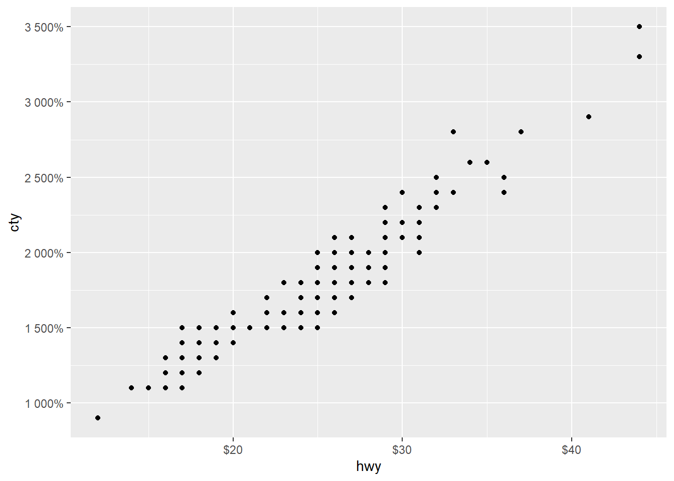
Expand
Use expand to give some extra space around the start / end points on the axis.
expand = c(*multiply*, *add*) can be a little confusing.
Use multiply to times the limits by a number to find the most
extreme values. Use add to manually expand a little by adding /
subtracting a number.
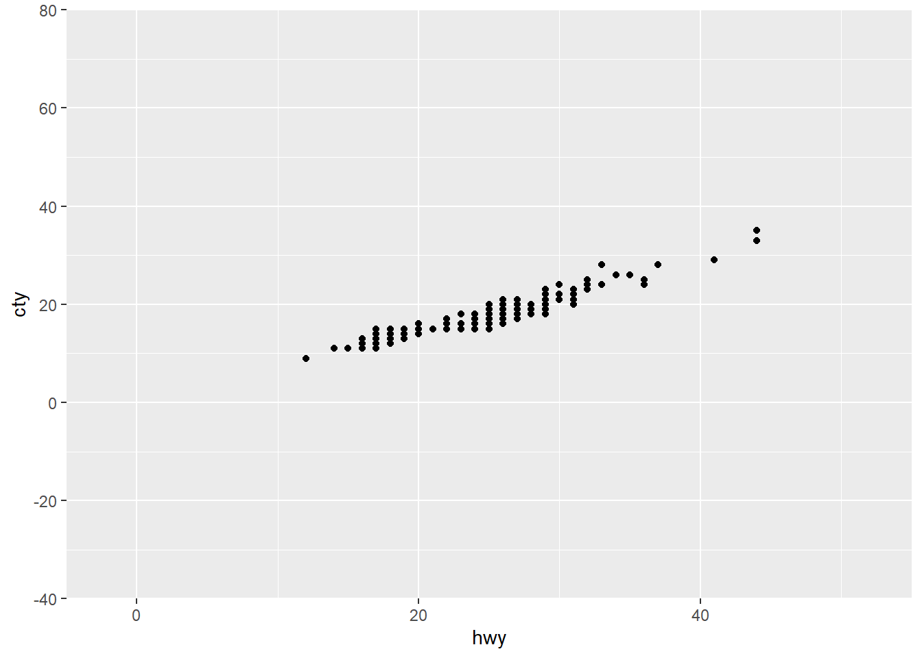
The below gives some extra space. We multiply the y axis by 40 to find the upper limit of 80, and the lower of -40. We add 5 to the x to find the limits of -5 and 45.
ggplot(data = mpg) +
  geom_point(mapping = aes(y = cty, x = hwy)) +
  scale_x_continuous(limits = c(0, 50), expand = c(0, 5)) +
  scale_y_continuous(limits = c(0, 40), expand = c(1, 0))