course_model
K-Means Neighbors Clustering
K-Means is a popular unsupervised machine learning algorithm used for clustering tasks. The algorithm works by partitioning the data into K distinct clusters based on feature similarity. There is no target variable in clustering, as the goal is to group similar data points together rather than predict a specific outcome.
Outcomes:
- Understand the K-Means clustering algorithm
- Learn how to choose the number of clusters (K) with an elbow plot
- Interpret clustering results
Algorithm Overview
K-Means is an unsupervised learning algorithm, meaning it does not use labeled data for training. It identifies patterns and structures in the data based on feature similarity.
The algorithm works by initializing K centroids (the center points of the clusters) and iteratively assigning data points to the nearest centroid and updating the centroids based on the assigned points.
Key Concepts:
- We do not use data splitting (train/test), as there is no dependent variable.
- When teaching, we will sometimes compare the clusters against an outcome variable to see how well the clusters align. However, this is not likely to be done with real-world problems, where you want to find natural groupings.
Problems:
- K-Means assumes that clusters are spherical and equally sized, which may not always be the case in real-world data.
- Choosing K is a subjective process.
- The elbow method is a common technique to help choose K by plotting the explained variance as a function of K and looking for an “elbow” point where the rate of decrease sharply changes
- However, there is no definitive way to choose K, and it may require domain knowledge or experimentation.
- Scaling features
- Feature scaling is important for distance-based algorithms like KNN
- Otherwise, features with larger scales can dominate the distance calculations (for example, age in years vs. income in thousands of dollars)
- Standardizing features can be done using techniques like Min-Max scaling or Z-score normalization.
Interpretation:
- Overall model:
- No accuracy measures! There is no dependent variable (except when teaching).
- We can visualize the clusters using scatter plots or other dimensionality reduction techniques (e.g., PCA) to see how well the clusters are separated.
- Individual predictions:
- We can evaluate the clustering quality using metrics like inertia (sum of squared distances to nearest centroid).
- Lower inertia indicates better-defined clusters.
- We can evaluate the clustering quality using metrics like inertia (sum of squared distances to nearest centroid).
Step 1: Load and Explore the Data
# Import required libraries
import numpy as np
import pandas as pd
import matplotlib.pyplot as plt
import seaborn as sns
from sklearn.datasets import load_iris
from sklearn.preprocessing import StandardScaler
from sklearn.cluster import KMeans
from sklearn.metrics import silhouette_score, confusion_matrix


# Load the Iris dataset
iris = load_iris()
X = iris.data
y = iris.target

# Create a DataFrame for easier manipulation
df = pd.DataFrame(X, columns=iris.feature_names)
df['species'] = iris.target_names[y]

df
| sepal length (cm) | sepal width (cm) | petal length (cm) | petal width (cm) | species | |
|---|---|---|---|---|---|
| 0 | 5.1 | 3.5 | 1.4 | 0.2 | setosa |
| 1 | 4.9 | 3.0 | 1.4 | 0.2 | setosa |
| 2 | 4.7 | 3.2 | 1.3 | 0.2 | setosa |
| 3 | 4.6 | 3.1 | 1.5 | 0.2 | setosa |
| 4 | 5.0 | 3.6 | 1.4 | 0.2 | setosa |
| ... | ... | ... | ... | ... | ... |
| 145 | 6.7 | 3.0 | 5.2 | 2.3 | virginica |
| 146 | 6.3 | 2.5 | 5.0 | 1.9 | virginica |
| 147 | 6.5 | 3.0 | 5.2 | 2.0 | virginica |
| 148 | 6.2 | 3.4 | 5.4 | 2.3 | virginica |
| 149 | 5.9 | 3.0 | 5.1 | 1.8 | virginica |
150 rows × 5 columns
Step 2: Standardize the Features
Standardization is crucial for K-Means because the algorithm is distance-based. Features with larger scales will dominate the distance calculations.
# Standardize the features
scaler = StandardScaler()
X_scaled = scaler.fit_transform(X)

print("Original data - first sample:")
print(X[0])
print("\nStandardized data - first sample:")
print(X_scaled[0])
print("\nMean of standardized features (should be ~0):")
print(X_scaled.mean(axis=0))
print("\nStd of standardized features (should be ~1):")
print(X_scaled.std(axis=0))
Original data - first sample:
[5.1 3.5 1.4 0.2]

Standardized data - first sample:
[-0.90068117  1.01900435 -1.34022653 -1.3154443 ]

Mean of standardized features (should be ~0):
[-1.69031455e-15 -1.84297022e-15 -1.69864123e-15 -1.40924309e-15]

Std of standardized features (should be ~1):
[1. 1. 1. 1.]
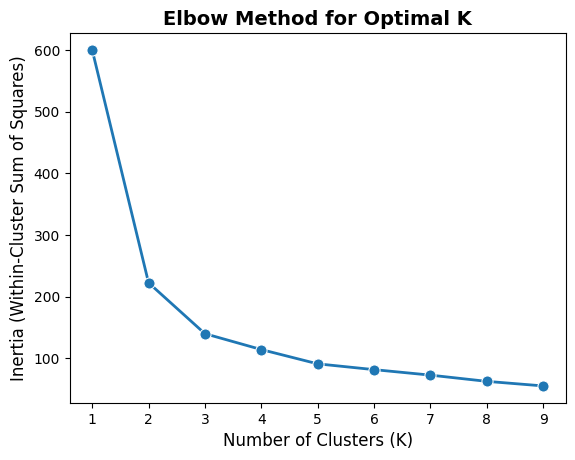
Step 3: Find Optimal Number of Clusters (Elbow Method)
The Elbow Method helps determine the optimal number of clusters (K) by plotting the inertia (within-cluster sum of squares) against different K values.
The inertia is the sum of squared distances between each point and its assigned cluster center. As K increases, inertia decreases because points are closer to their cluster centers. The goal is to find the “elbow” point where the rate of decrease sharply changes, indicating a suitable K.
# Plot inertia for different numbers of clusters
import seaborn as sns
import matplotlib.pyplot as plt

inertias = []
range_tested = range(1, 10)

for k in range_tested:
    # K-Means clustering function uses a given number of clusters, a random variable for reproducibility,
    # and n_init for stability (number of initializations, meaning the algorithm will run multiple times
    # with different centroid seeds)
    kmeans = KMeans(n_clusters=k, random_state=42, n_init=10)
    kmeans.fit(X_scaled)
    inertias.append(kmeans.inertia_)

# Plot the elbow curve as a single plot
sns.lineplot(x=range_tested, y=inertias, marker='o', linewidth=2, markersize=8)
plt.xlabel('Number of Clusters (K)', fontsize=12)
plt.ylabel('Inertia (Within-Cluster Sum of Squares)', fontsize=12)
plt.title('Elbow Method for Optimal K', fontsize=14, fontweight='bold')
plt.show()
Step 4: Build and Fit the K-Means Model
# Create and fit K-Means model with 3 clusters
kmeans = KMeans(n_clusters=3, random_state=42, n_init=10)
cluster_labels = kmeans.fit_predict(X_scaled)

# Add cluster labels to the dataframe
df['cluster'] = cluster_labels

print("Cluster Centers (standardized):")
print(kmeans.cluster_centers_)
print("\nCluster Distribution:")
print(df['cluster'].value_counts().sort_index())
print("\nSilhouette Score:", silhouette_score(X_scaled, cluster_labels))
Cluster Centers (standardized):
[[-0.05021989 -0.88337647  0.34773781  0.2815273 ]
 [-1.01457897  0.85326268 -1.30498732 -1.25489349]
 [ 1.13597027  0.08842168  0.99615451  1.01752612]]

Cluster Distribution:
cluster
0    53
1    50
2    47
Name: count, dtype: int64

Silhouette Score: 0.45994823920518635
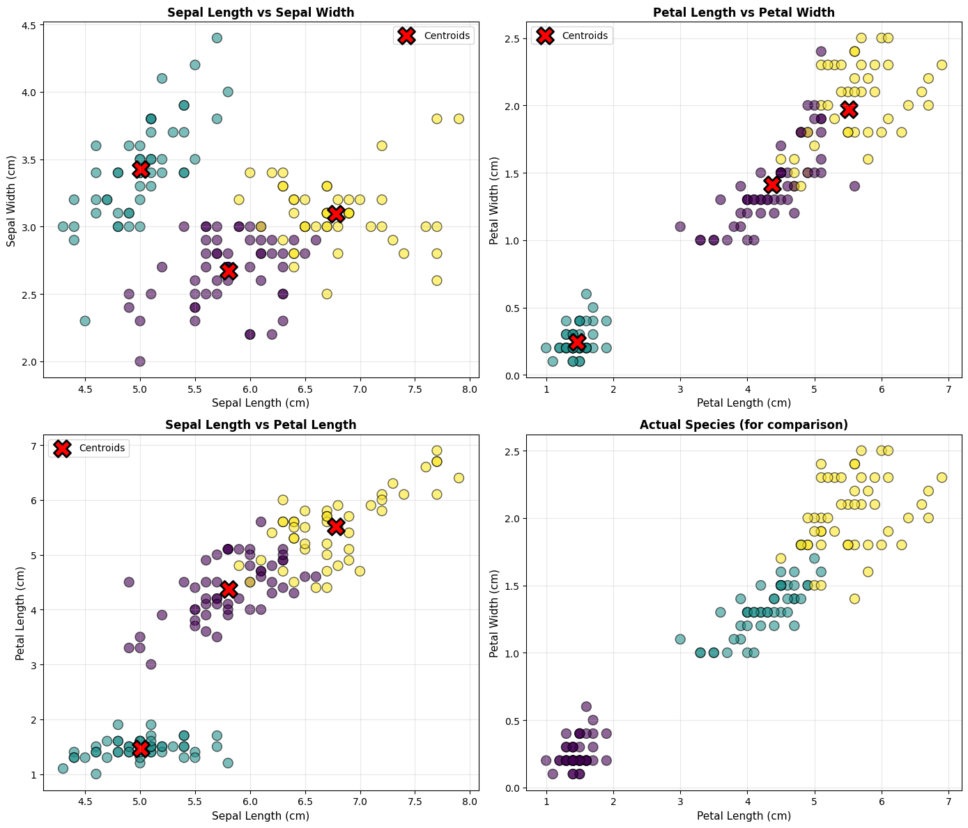
Step 5: Visualize the Clusters
# Create scatter plots for different feature combinations
fig, axes = plt.subplots(2, 2, figsize=(14, 12))

# Plot 1: Sepal Length vs Sepal Width
ax = axes[0, 0]
scatter1 = ax.scatter(df['sepal length (cm)'], df['sepal width (cm)'],
                      c=df['cluster'], cmap='viridis', s=100, alpha=0.6, edgecolors='black')
ax.scatter(scaler.inverse_transform(kmeans.cluster_centers_)[:, 0],
           scaler.inverse_transform(kmeans.cluster_centers_)[:, 1],
           c='red', marker='X', s=300, edgecolors='black', linewidths=2, label='Centroids')
ax.set_xlabel('Sepal Length (cm)', fontsize=11)
ax.set_ylabel('Sepal Width (cm)', fontsize=11)
ax.set_title('Sepal Length vs Sepal Width', fontsize=12, fontweight='bold')
ax.legend()
ax.grid(True, alpha=0.3)

# Plot 2: Petal Length vs Petal Width
ax = axes[0, 1]
scatter2 = ax.scatter(df['petal length (cm)'], df['petal width (cm)'],
                      c=df['cluster'], cmap='viridis', s=100, alpha=0.6, edgecolors='black')
ax.scatter(scaler.inverse_transform(kmeans.cluster_centers_)[:, 2],
           scaler.inverse_transform(kmeans.cluster_centers_)[:, 3],
           c='red', marker='X', s=300, edgecolors='black', linewidths=2, label='Centroids')
ax.set_xlabel('Petal Length (cm)', fontsize=11)
ax.set_ylabel('Petal Width (cm)', fontsize=11)
ax.set_title('Petal Length vs Petal Width', fontsize=12, fontweight='bold')
ax.legend()
ax.grid(True, alpha=0.3)

# Plot 3: Sepal Length vs Petal Length
ax = axes[1, 0]
scatter3 = ax.scatter(df['sepal length (cm)'], df['petal length (cm)'],
                      c=df['cluster'], cmap='viridis', s=100, alpha=0.6, edgecolors='black')
ax.scatter(scaler.inverse_transform(kmeans.cluster_centers_)[:, 0],
           scaler.inverse_transform(kmeans.cluster_centers_)[:, 2],
           c='red', marker='X', s=300, edgecolors='black', linewidths=2, label='Centroids')
ax.set_xlabel('Sepal Length (cm)', fontsize=11)
ax.set_ylabel('Petal Length (cm)', fontsize=11)
ax.set_title('Sepal Length vs Petal Length', fontsize=12, fontweight='bold')
ax.legend()
ax.grid(True, alpha=0.3)

# Plot 4: Comparison with actual species
ax = axes[1, 1]
species_colors = {'setosa': 0, 'versicolor': 1, 'virginica': 2}
scatter4 = ax.scatter(df['petal length (cm)'], df['petal width (cm)'],
                      c=df['species'].map(species_colors), cmap='viridis',
                      s=100, alpha=0.6, edgecolors='black')
ax.set_xlabel('Petal Length (cm)', fontsize=11)
ax.set_ylabel('Petal Width (cm)', fontsize=11)
ax.set_title('Actual Species (for comparison)', fontsize=12, fontweight='bold')
ax.grid(True, alpha=0.3)

plt.tight_layout()
plt.show()
Step 6: Evaluate Model Performance
Since we have the actual species labels, we can compare our clusters with the true labels.
# Create confusion matrix
cm = confusion_matrix(y, cluster_labels)

# Plot confusion matrix
plt.figure(figsize=(8, 6))
sns.heatmap(cm, annot=True, fmt='d', cmap='Blues',
            xticklabels=['Cluster 0', 'Cluster 1', 'Cluster 2'],
            yticklabels=iris.target_names, cbar_kws={'label': 'Count'})
plt.xlabel('Predicted Cluster', fontsize=12)
plt.ylabel('Actual Species', fontsize=12)
plt.title('Confusion Matrix: Clusters vs Actual Species', fontsize=14, fontweight='bold')
plt.tight_layout()
plt.show()

# Calculate cluster purity
cluster_species = pd.crosstab(df['species'], df['cluster'])
print("Cluster composition by species:")
print(cluster_species)
print("\n" + "="*50)
print("Analysis:")
print("="*50)
for cluster in range(3):
    dominant_species = cluster_species[cluster].idxmax()
    purity = cluster_species[cluster].max() / cluster_species[cluster].sum()
    print(f"Cluster {cluster}: Mainly {dominant_species} ({purity:.1%} purity)")
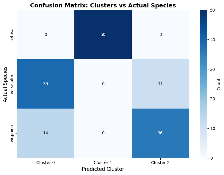
Cluster composition by species:
cluster      0   1   2
species
setosa       0  50   0
versicolor  39   0  11
virginica   14   0  36

==================================================
Analysis:
==================================================
Cluster 0: Mainly versicolor (73.6% purity)
Cluster 1: Mainly setosa (100.0% purity)
Cluster 2: Mainly virginica (76.6% purity)